The Rio Kitchen
Roles - Creative Direction, Photography and Production
The client
The Rio Kitchen is a Brazilian food and wellness blog built around a deceptively simple premise — that eating well should be vibrant, balanced, and culturally rooted. The blogger had already built a loyal audience around her warmth, her personality, and her signature Perfect Plate content: nutritionally balanced meals told through the lens of how Brazilians actually eat. What she hadn't yet built was a visual identity that matched any of it. The imagery on her site didn't reflect the colour, the energy, or the cultural pride that her audience showed up for. That's where the work began.
The brief
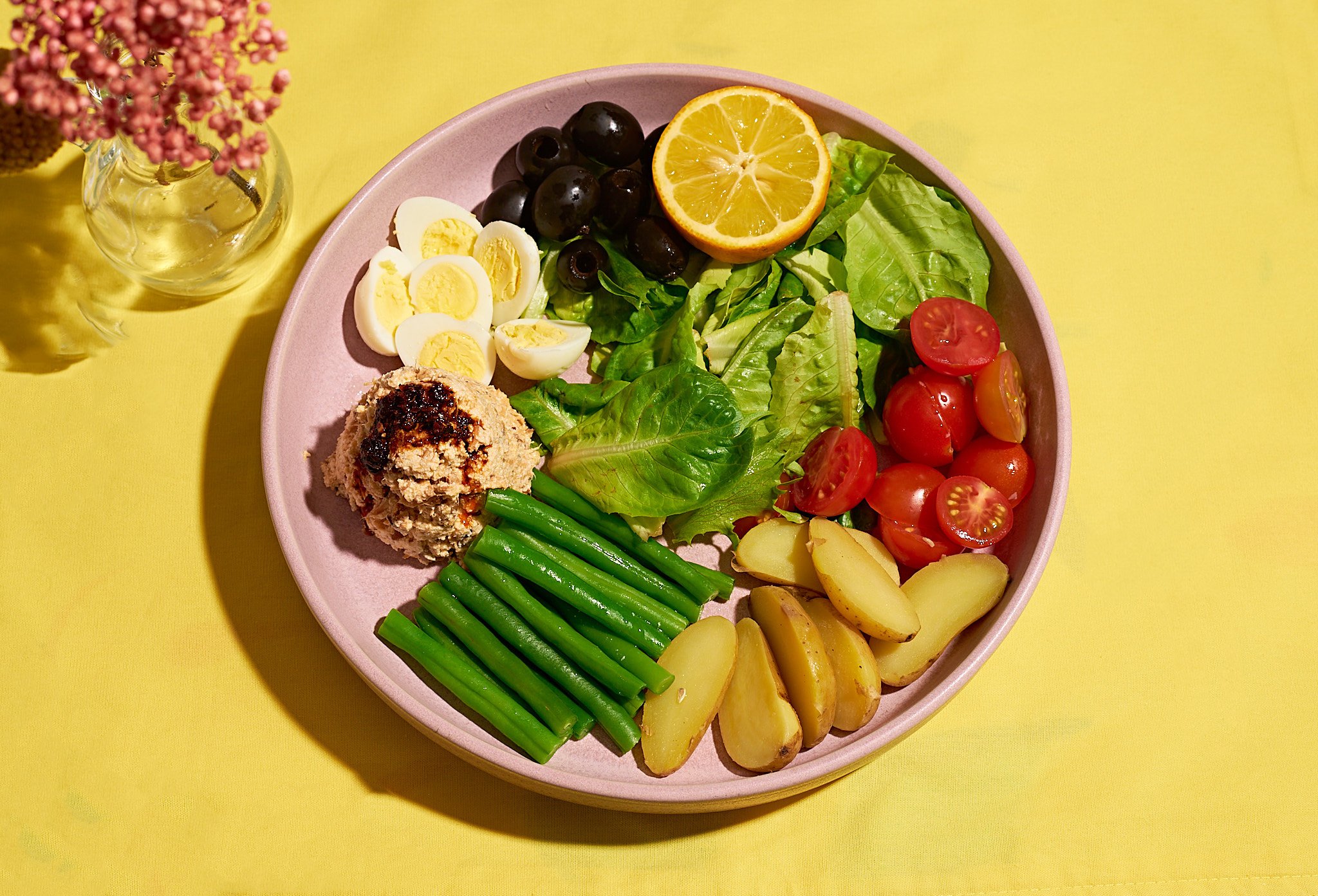
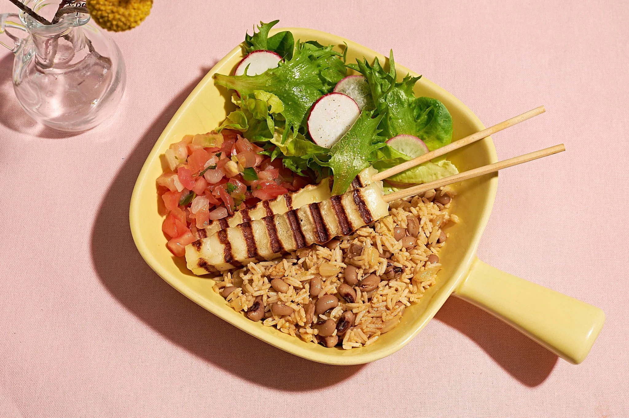
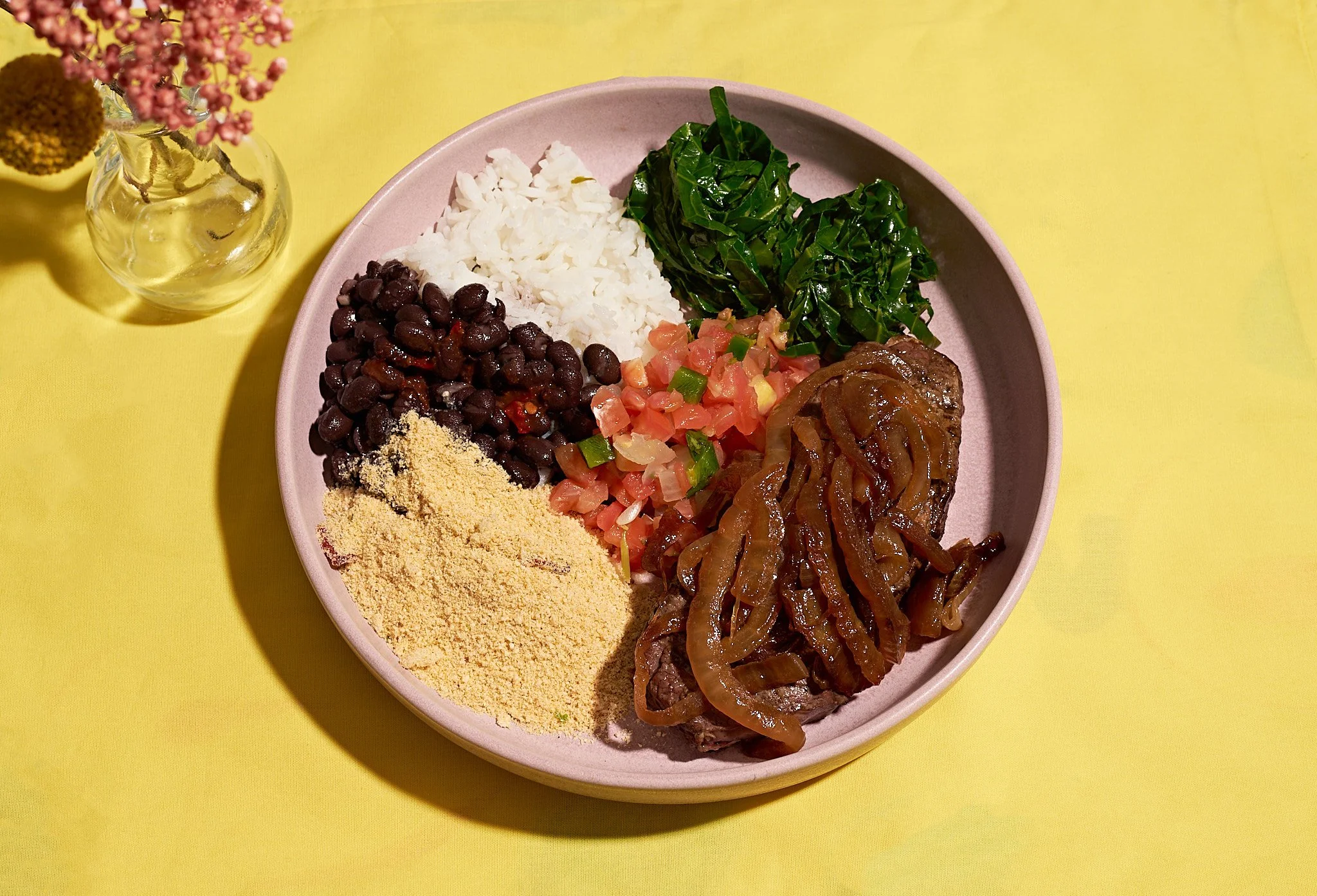
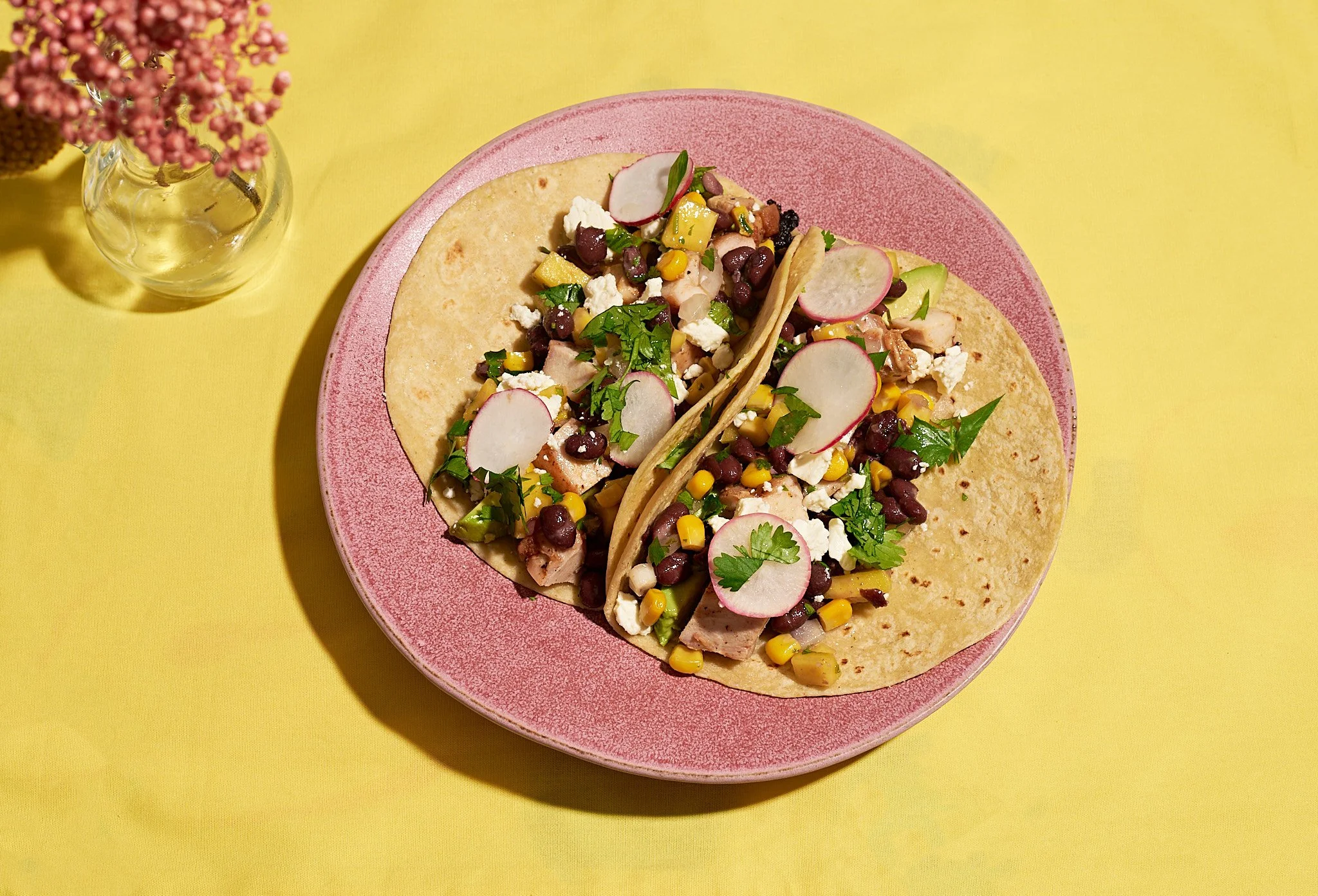
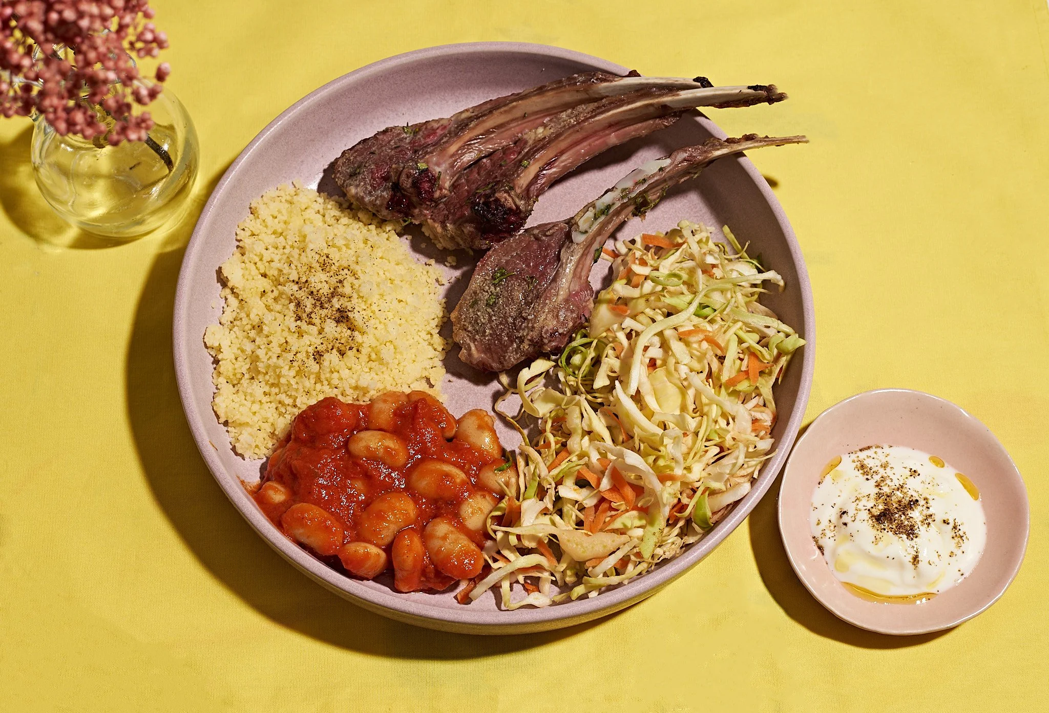
A full website visual refresh, anchored by a dedicated series for her signature Perfect Plate content — nutritionally balanced meals told through the lens of the Brazilian way of eating. The work needed to feel as alive and colorful as the voice her audience already knew and loved.
The challenge
Two things had to work in tension: a tight budget, and the need to centre the client's personality in the visual identity — because that warmth and Brazilian spirit was exactly what had been missing from her existing imagery. We were shooting in her kitchen, with her props, on a two-week timeline.
The process
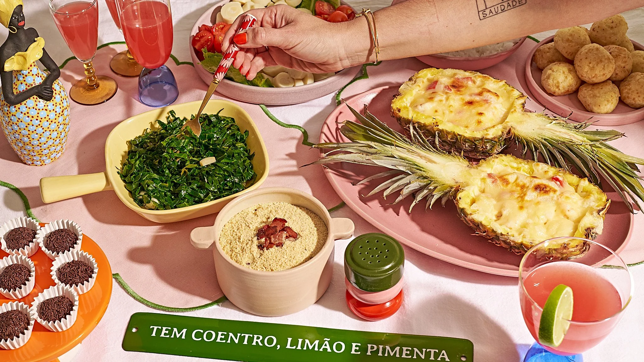
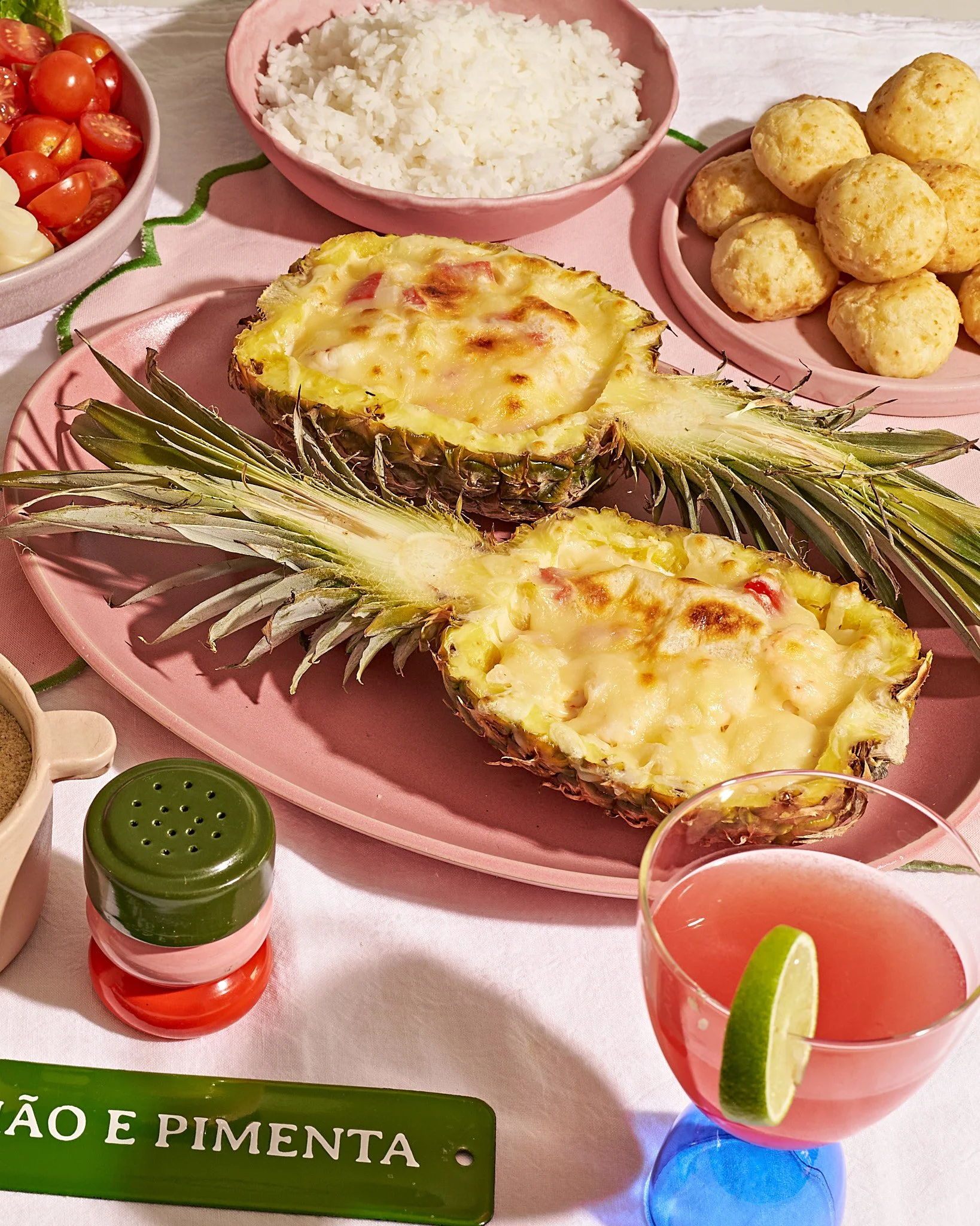
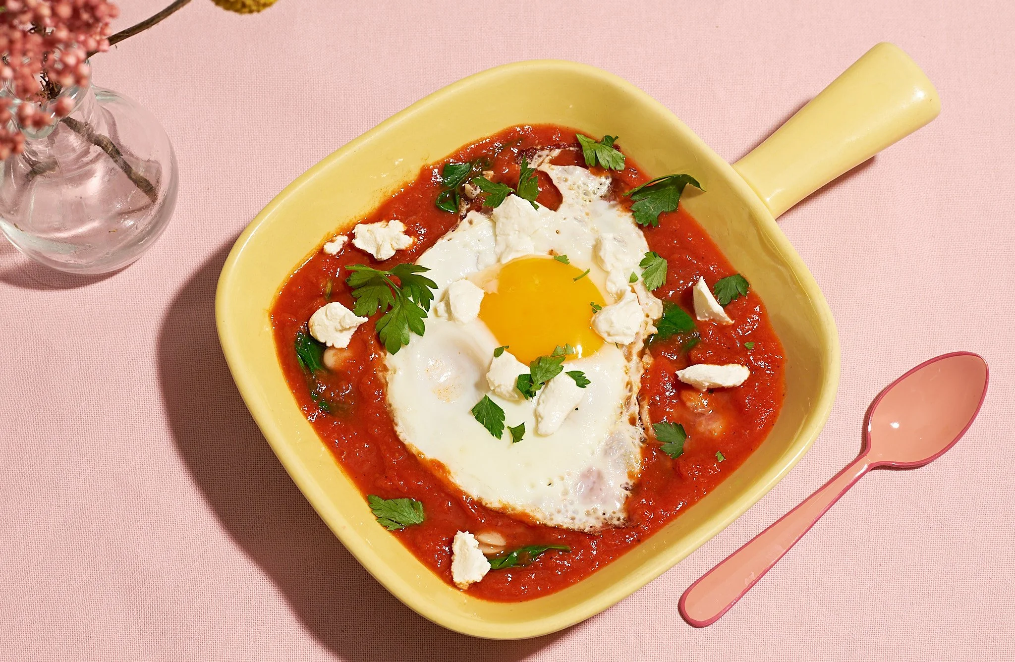
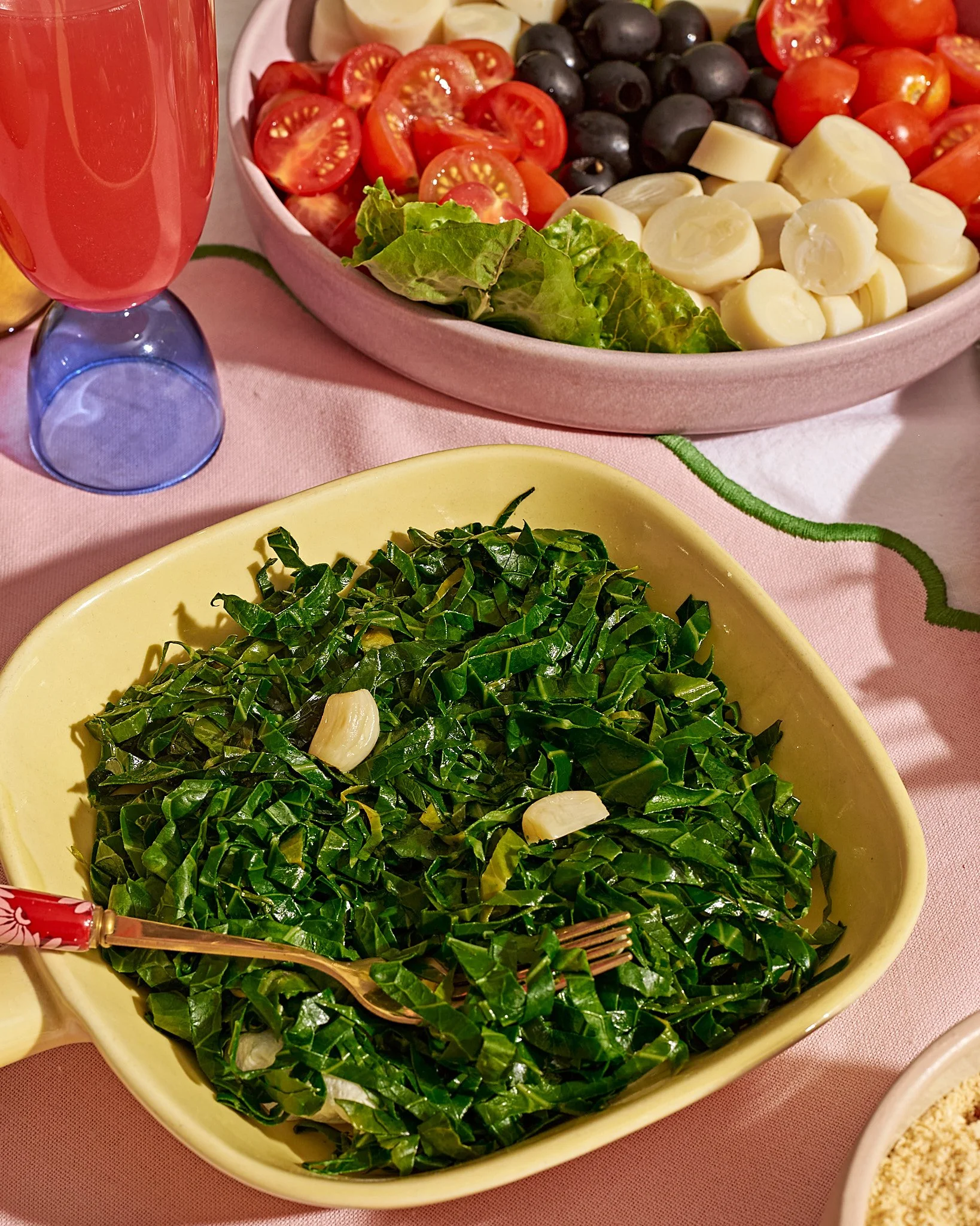
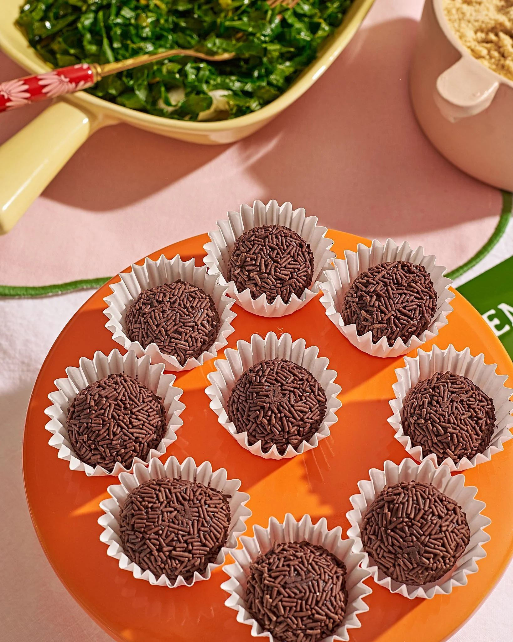
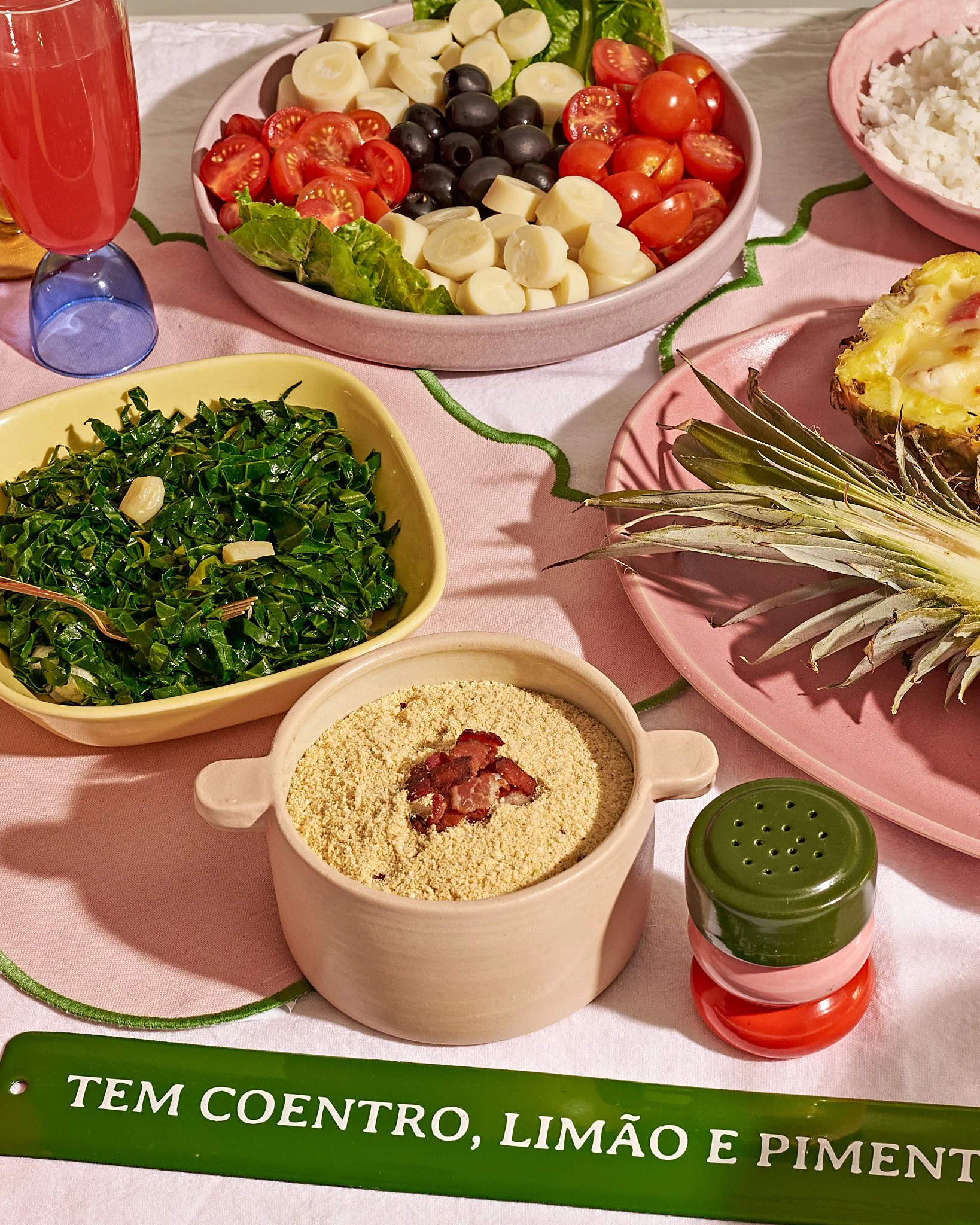
I developed the mood board around Colorful Maximalism — a world that felt joyful, sun-drenched, and unapologetically Brazilian. For prop selection, I made a deliberate choice to work with pieces from the client's own shop, keeping the palette to a two-tone pink and yellow. The reasoning was precise: the restraint kept the colour story cohesive without competing with the food, which was predominantly green and brown and needed to remain the hero.
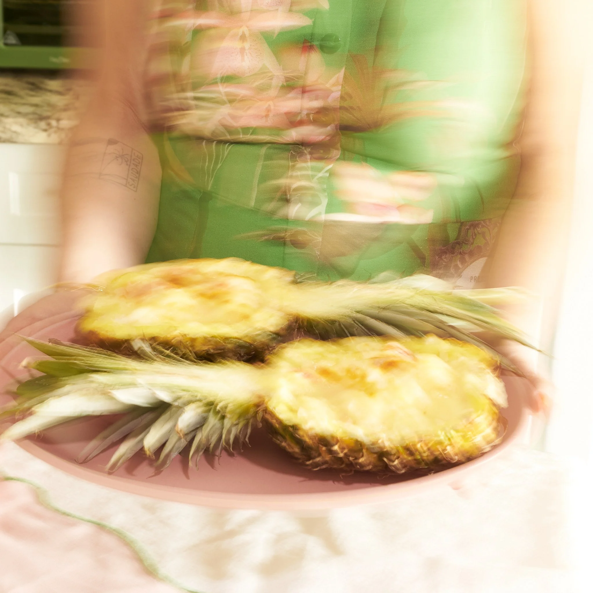
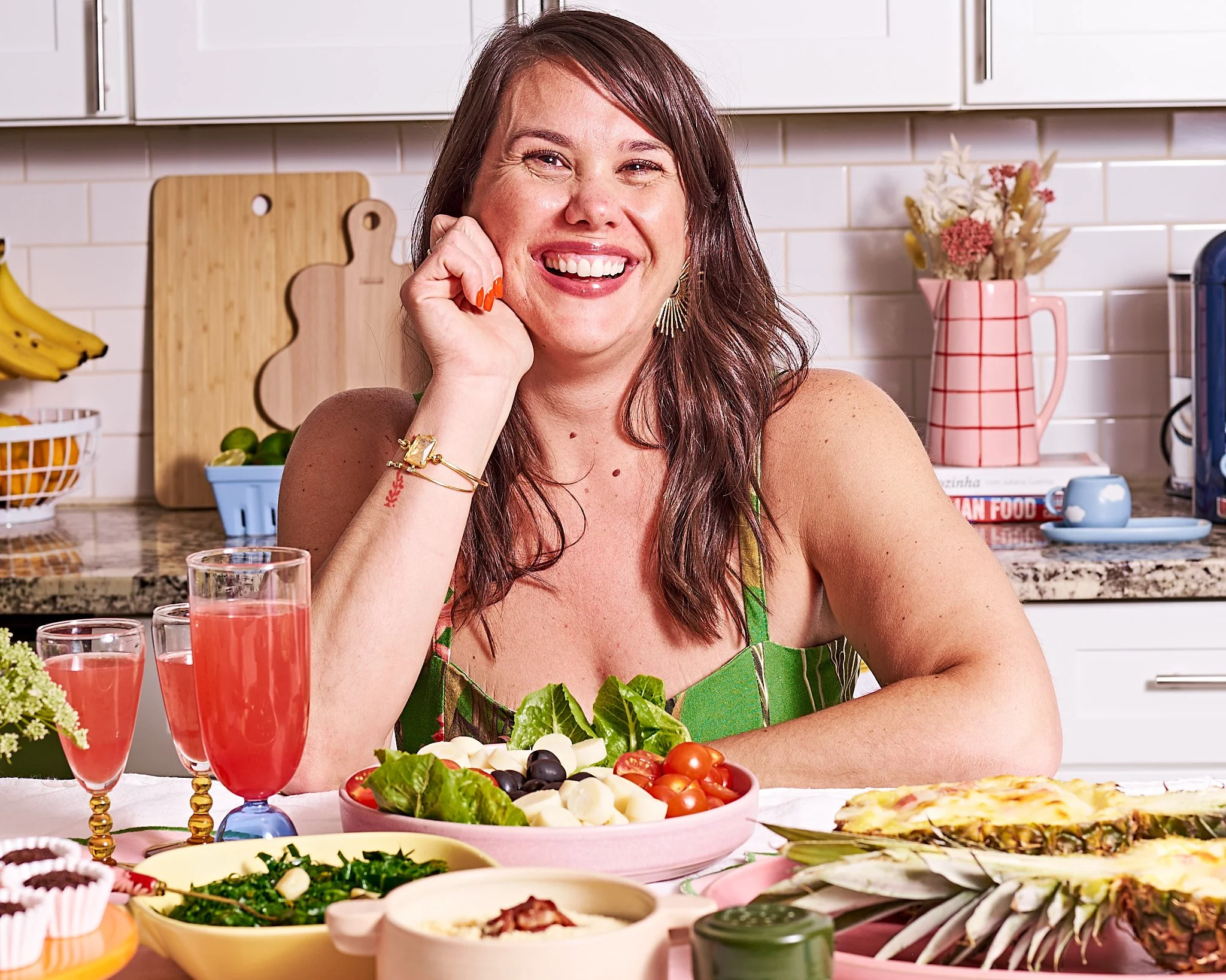
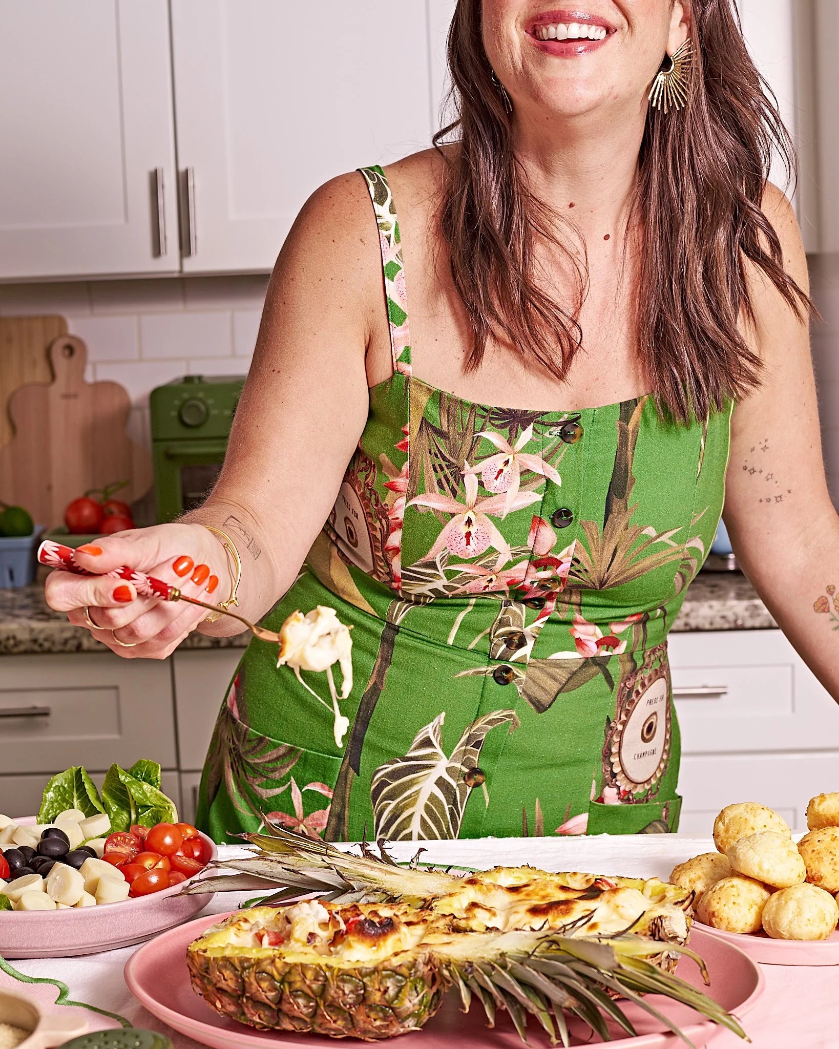
A few days before the shoot, the client mentioned she also wanted to film Perfect Plate videos alongside the stills. Rather than treating it as a disruption, we built it into the schedule — the shoot became a dual-format production day without losing momentum or quality.
The outcome
The imagery was published across her Website, Substack, and newsletter and socialmedia. The client loved it. The work gave The Rio Kitchen a visual identity that finally matched the personality she'd been building — culturally grounded, warm, and ready to grow.
Creative POV
This project reflects something central to the way I work: the visual world has to come from the brand's story, not imposed onto it. With smaller brands especially, that means getting to know the person behind it — their why, their personality, the feeling they want to leave with their audience. Here, the brief was color and culture, so that's what we built. The result was imagery that didn't just look good — it felt like her.
Client Testimonial
Working with Nikitha was an incredible experience! She did a phenomenal job capturing the essence of my brand with both creativity and precision. From start to finish, she was highly organized, professional, and thoughtful in every detail. I couldn’t be happier with the final photos and would highly recommend her to anyone looking for someone with both an exceptional eye for branding and photography talent - Camille Morgenstern, The Rio Kitchen