Kathaas Chai ( Formerly Sinwise Chai)
Roles - Creative Direction, Photography and Production
The client
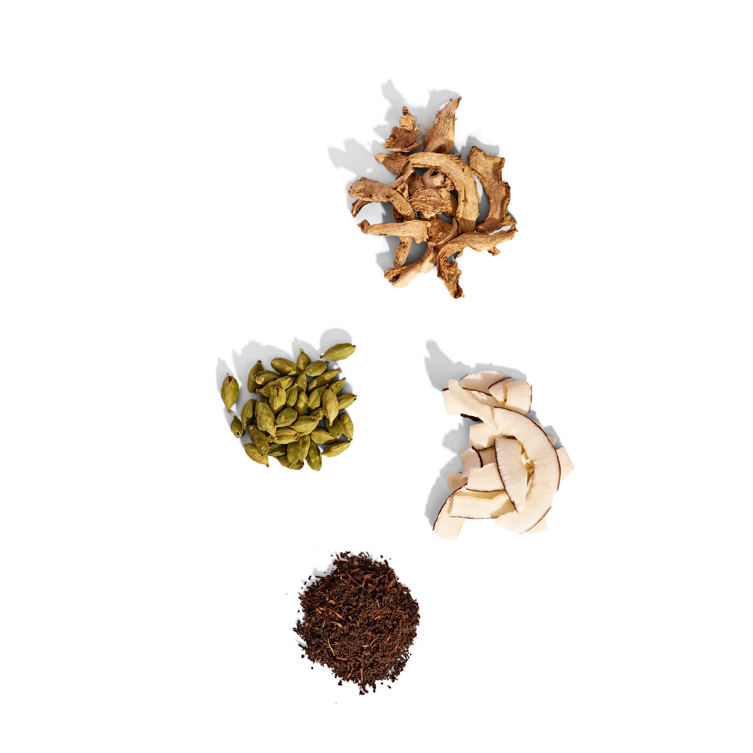
Kathaas Chai is a South Indian chai brand built around something genuinely rare in the western market — ingredients sourced from family farms in the southern hills of India, a region and a chai tradition that has virtually no visual identity or shelf presence in the US. When Sinwise Chai became Kathaas, it wasn't just a name change. It was a full brand identity overhaul, and the imagery had to carry that story.
The brief
New packaging, new name, new visual world — and a hard deadline. The client needed a complete set of launch images in time for a trade show, with only two weeks from the moment the final packaging arrived. The work had to do something the category had never really done: represent South Indian chai authentically, and make it feel at home on a western shelf without losing what made it distinct.
The challenge
There was no existing visual language to borrow from. South Indian chai is a near-invisible category in western markets, which meant the imagery couldn't reference anything familiar — it had to build the world from scratch. The concept needed to communicate origin, craft, and naturalness all at once, and do it on a production budget.
The process
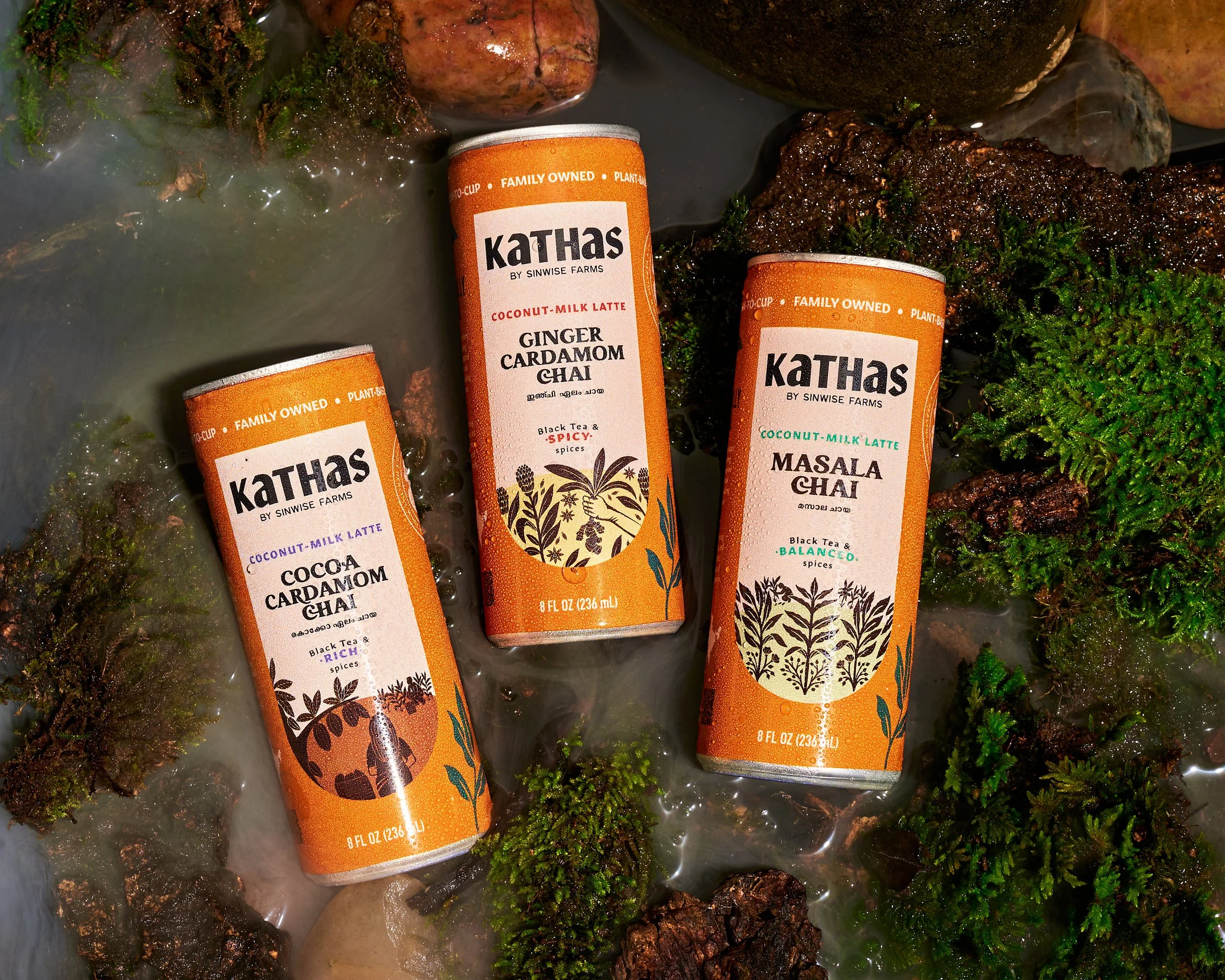
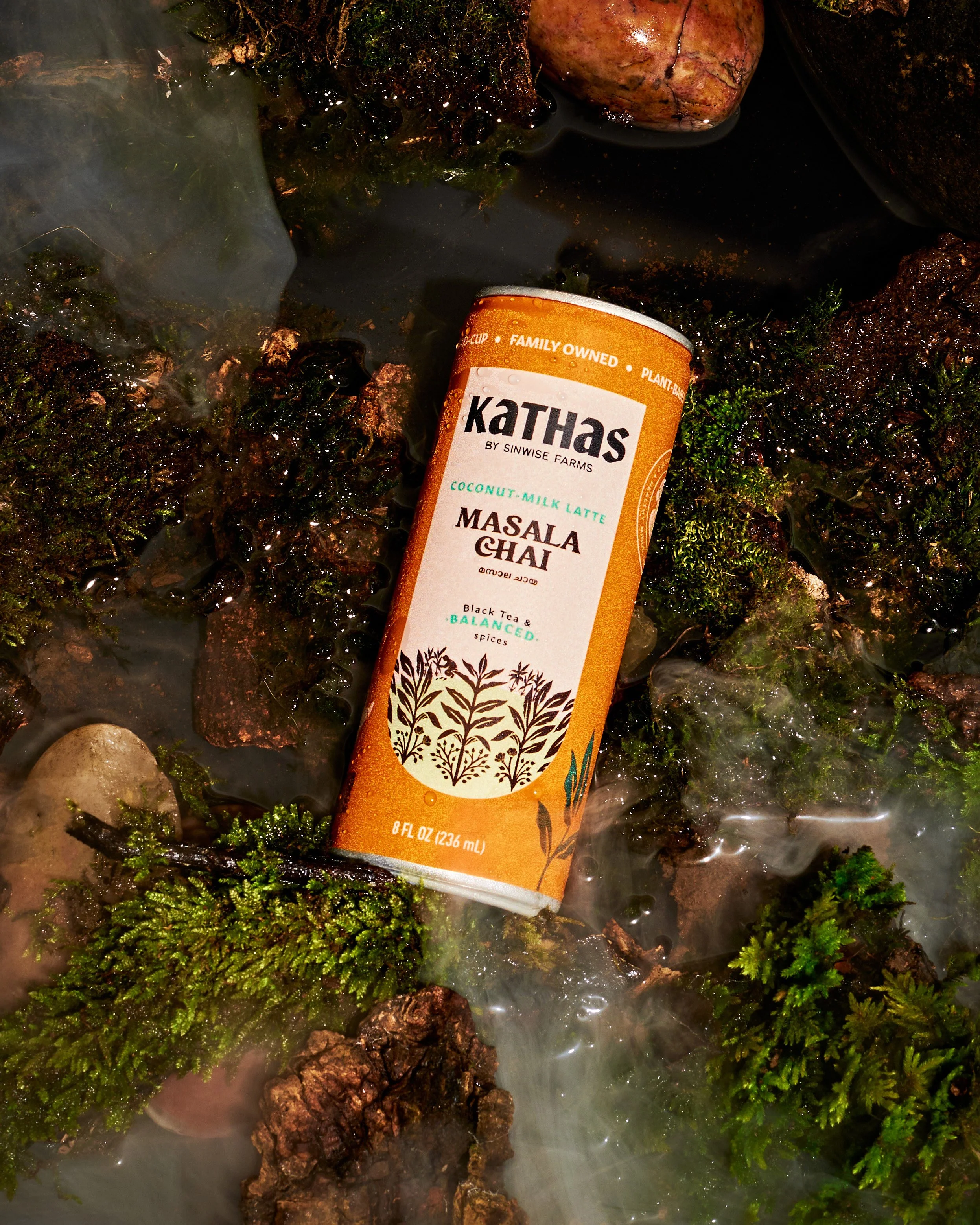
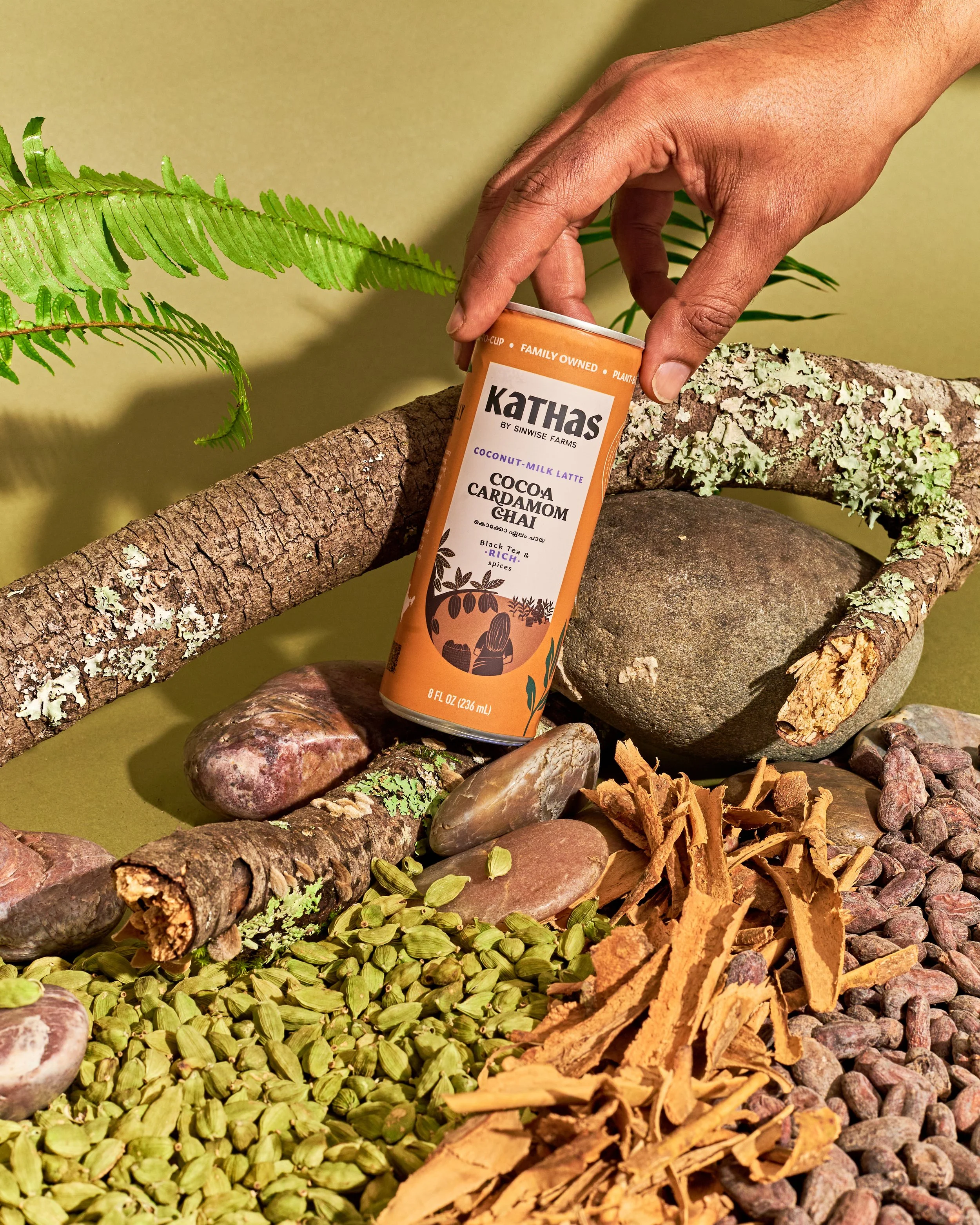
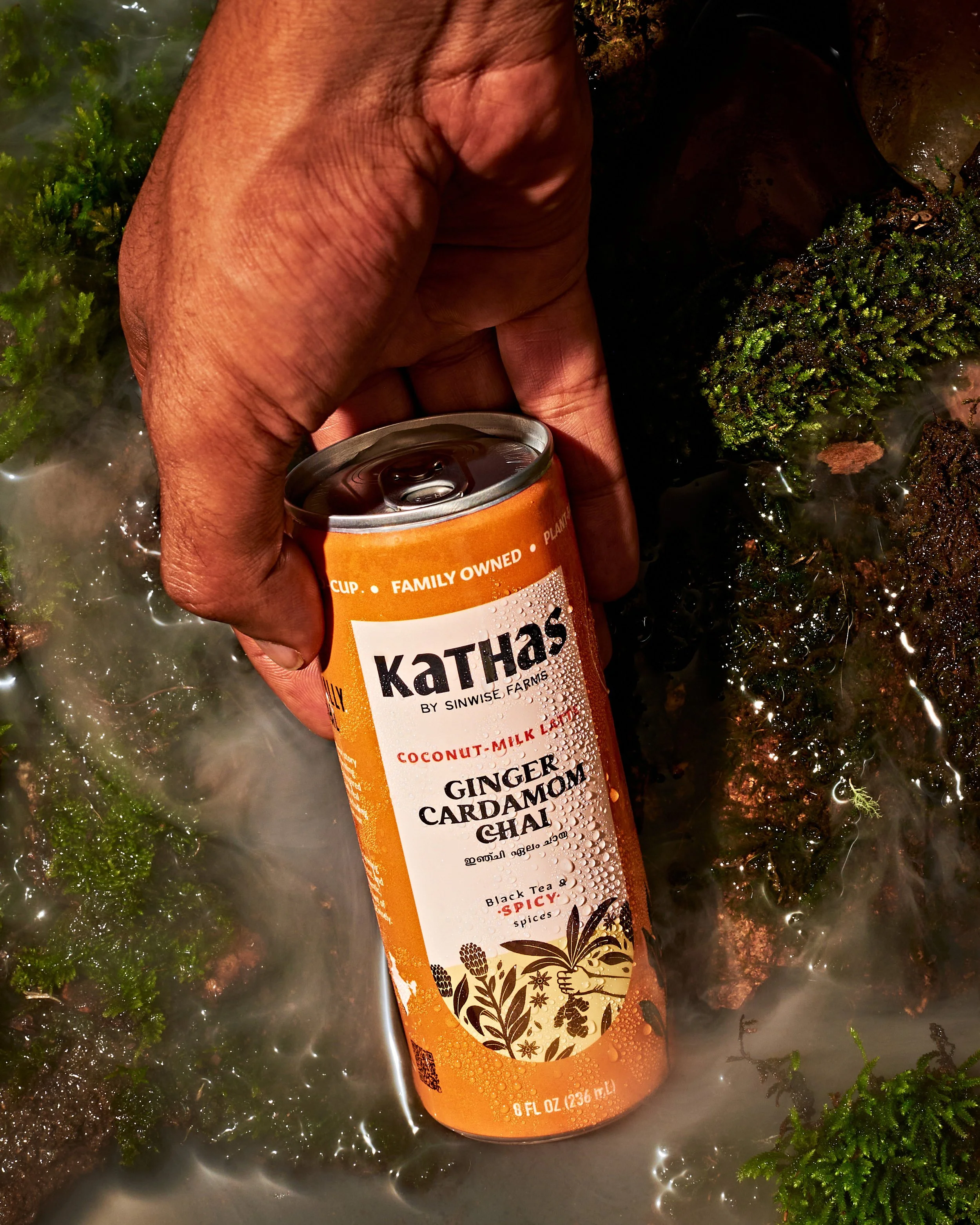
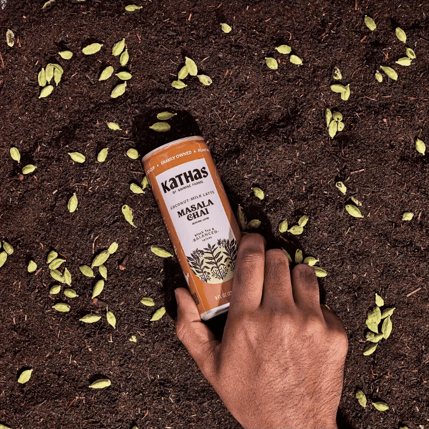
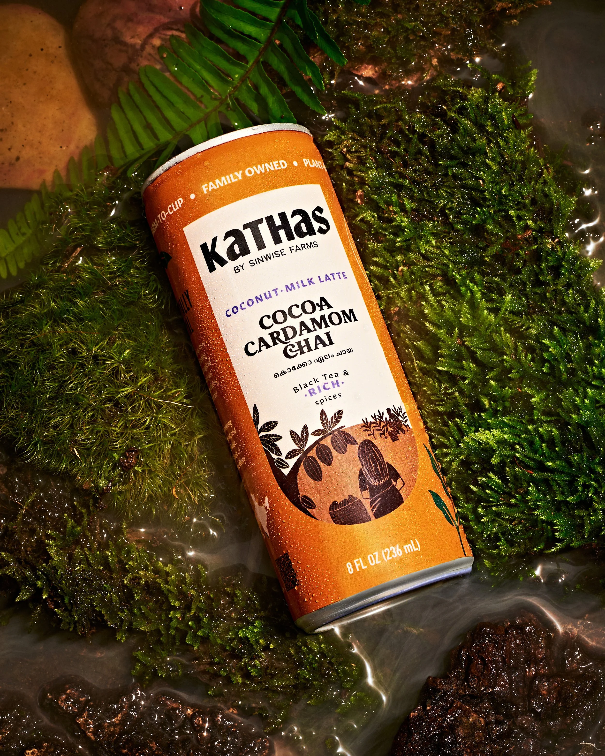
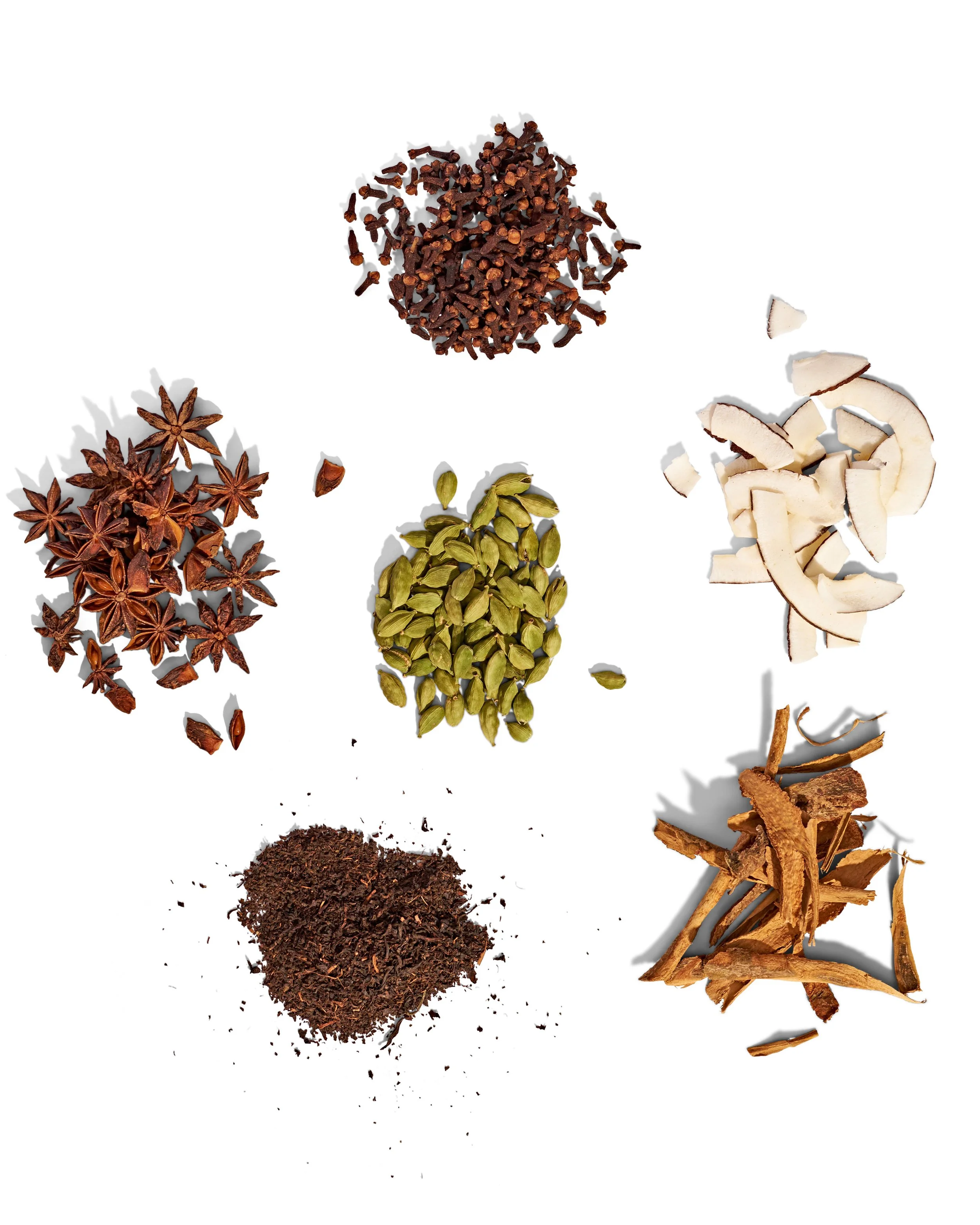
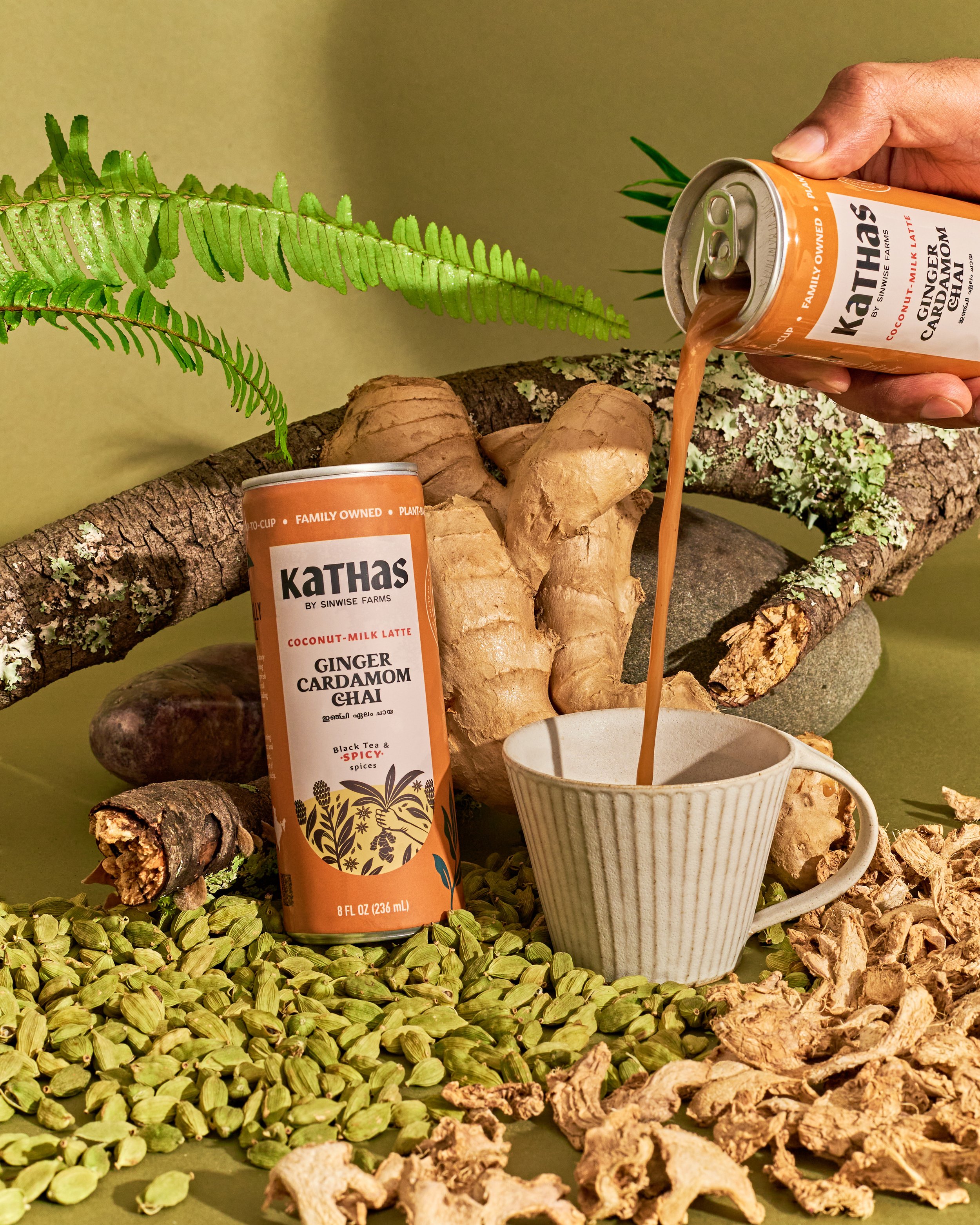
The creative direction I landed on was to bring the South Indian hills into the studio — literally. Rather than shoot against a clean, product-focused backdrop, I wanted the ingredients and packaging to live inside a world: woody, mossy, foggy, and wet. The feeling of a forest floor after rain. The kind of environment where these plants actually grow.
I developed the mood board and brought in a prop stylist who went foraging for natural elements to build the set. Once I'd briefed her on the brand, the vision, and the look and feel, she sourced everything — moss, bark, foliage, earth — and we constructed the environment from the ground up in studio.
Midway through the shoot, the client's preferences shifted. Certain setups were connecting with him more than others, and he wanted to lean into those and let go of some of the planned shots. We pivoted the shot list on the day, reorganised the schedule, and made it work — protecting the shots that mattered most while still finishing on time.
The outcome
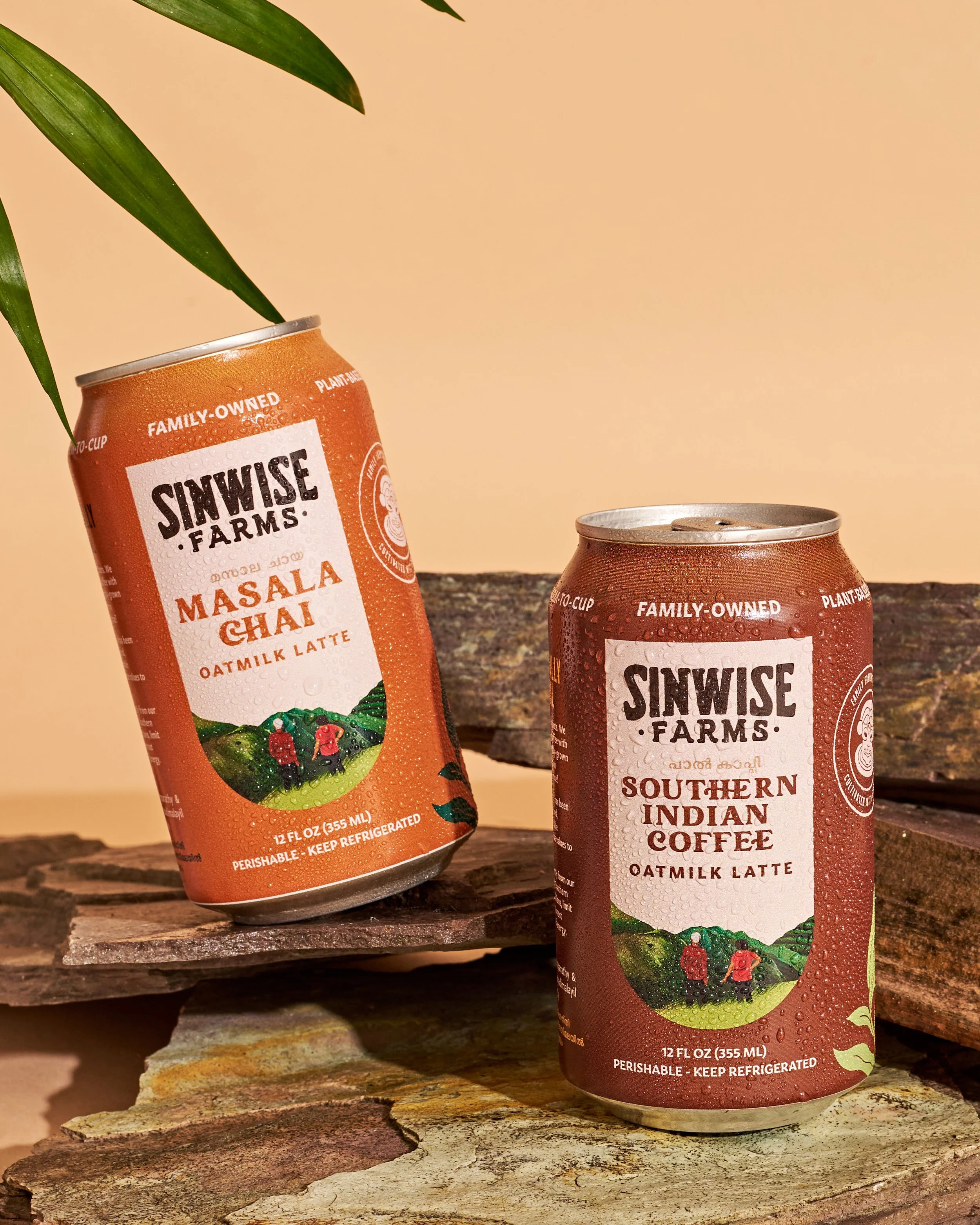
The images were used across the Kathaas website, social channels, print banners, posters, and newsletters — and debuted at a trade show within two weeks of the packaging landing. For the client, it was his first major investment in brand photography, and the shoot gave Kathaas a visual identity that finally matched the quality and heritage of what was in the tin.
Sinwise Chai was also in circulation at the time - and the client needed some updated visuals for those as well, keeping in theme with the new branding but simpler and we also planned for that during our shoot and delivered.
Creative POV
This project pushed me out of my usual colour-forward territory and into something more strategic and elemental. The brief wasn't about palette — it was about place, provenance, and making the invisible visible. My job was to build the world the brand lives in, and in this case that world was the hills of South India, reconstructed on a studio floor in California. That kind of problem — where the category doesn't exist yet, so the imagery has to define it.