Sprinkles - Chocolate
Roles - Creative Direction, Photography and Production
The client
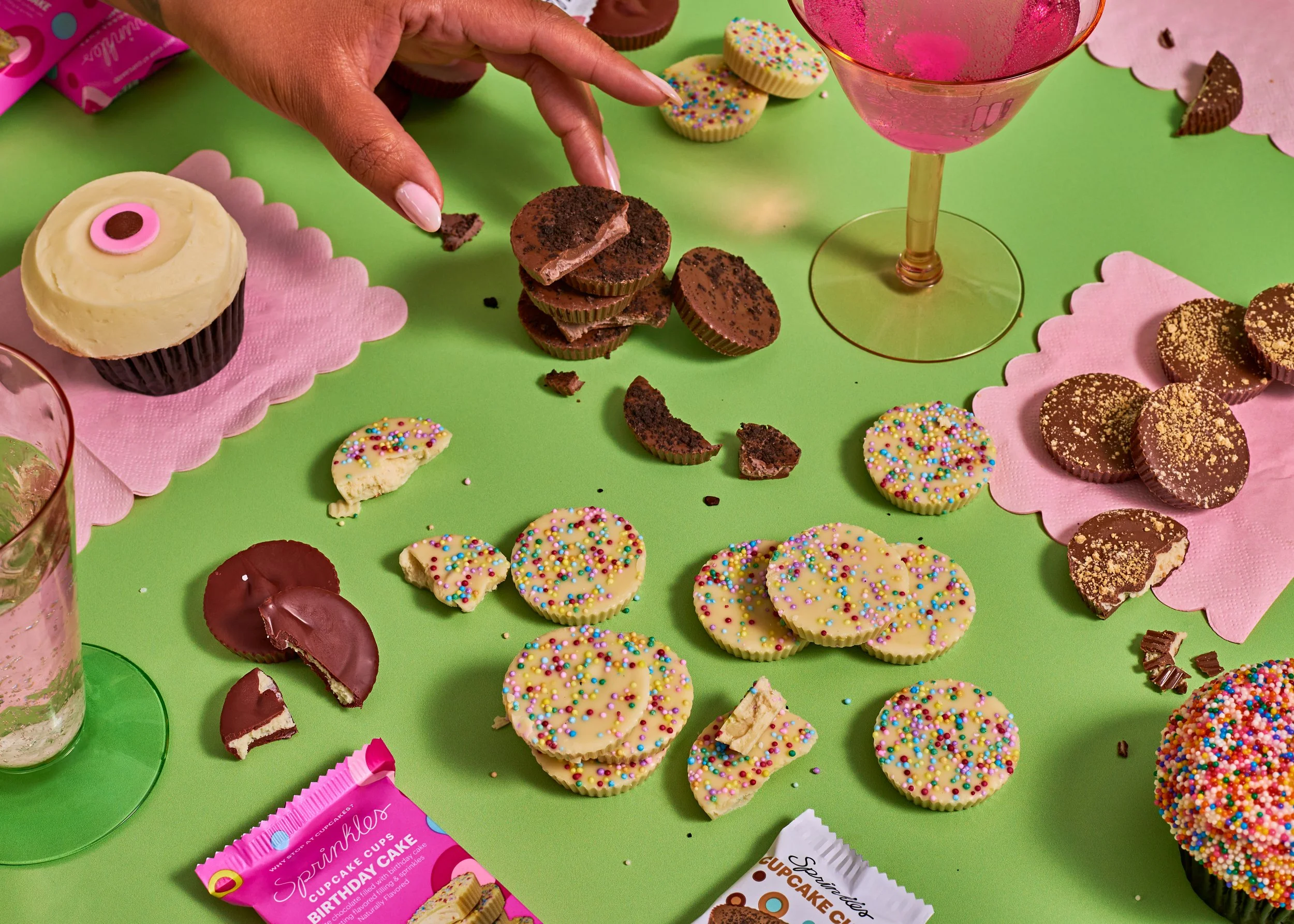
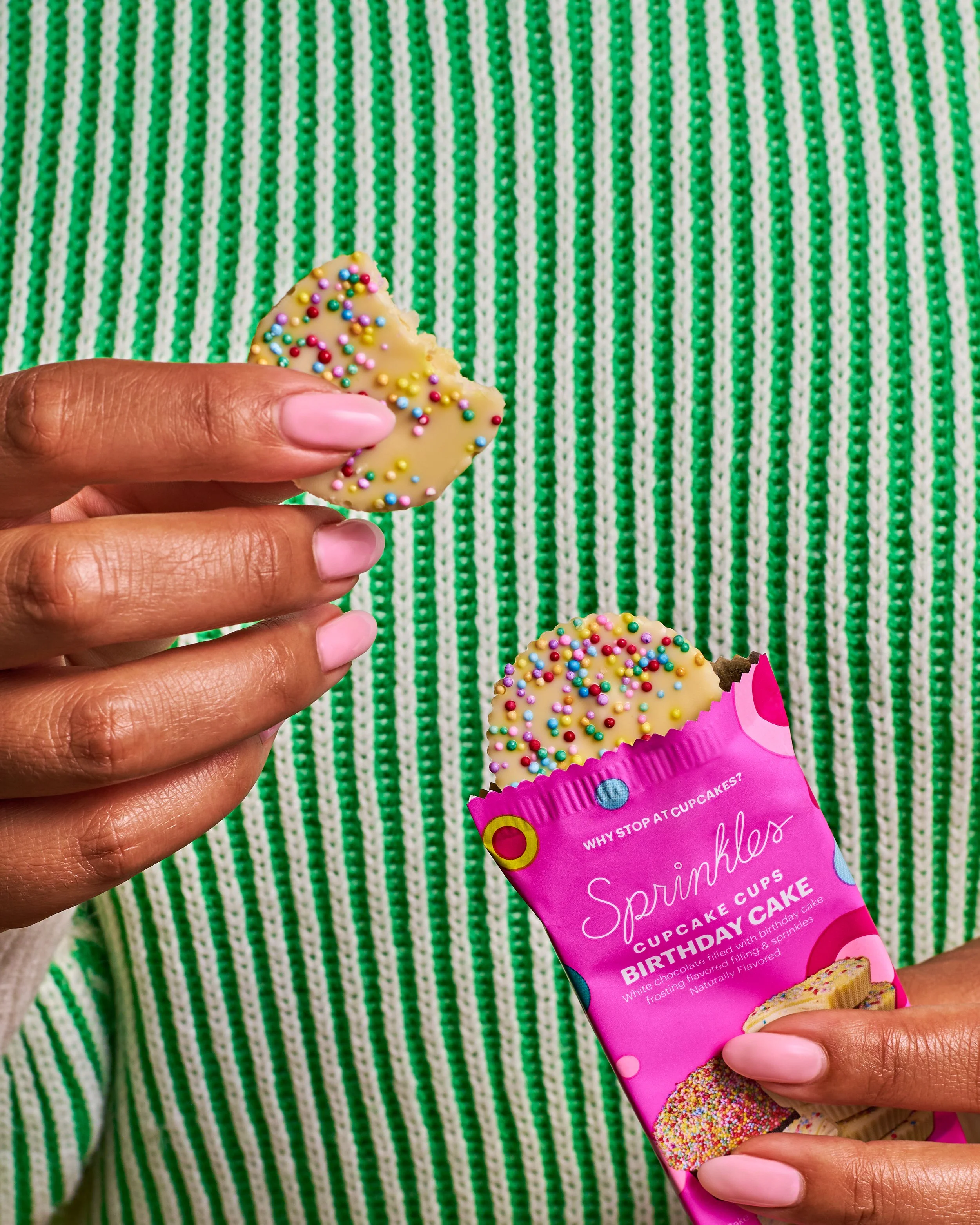
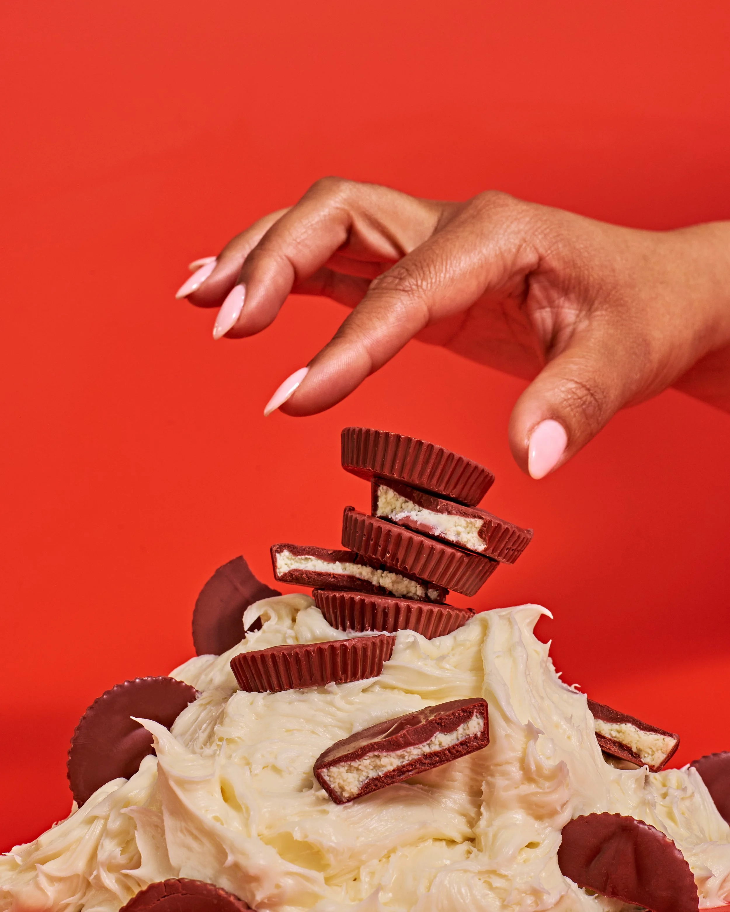
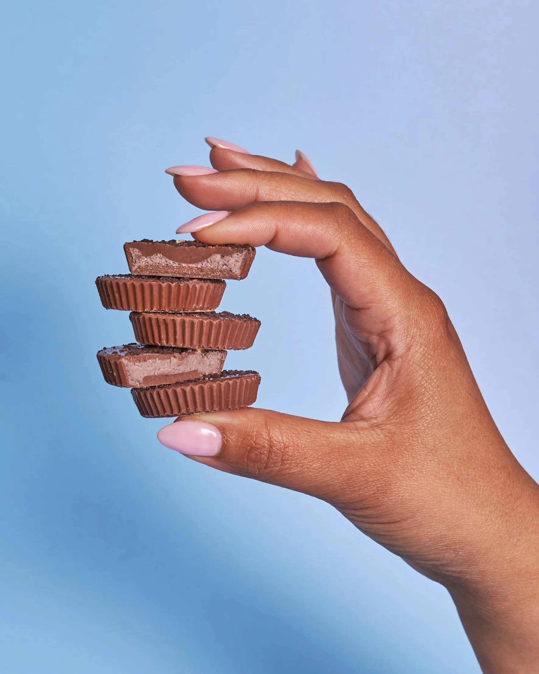
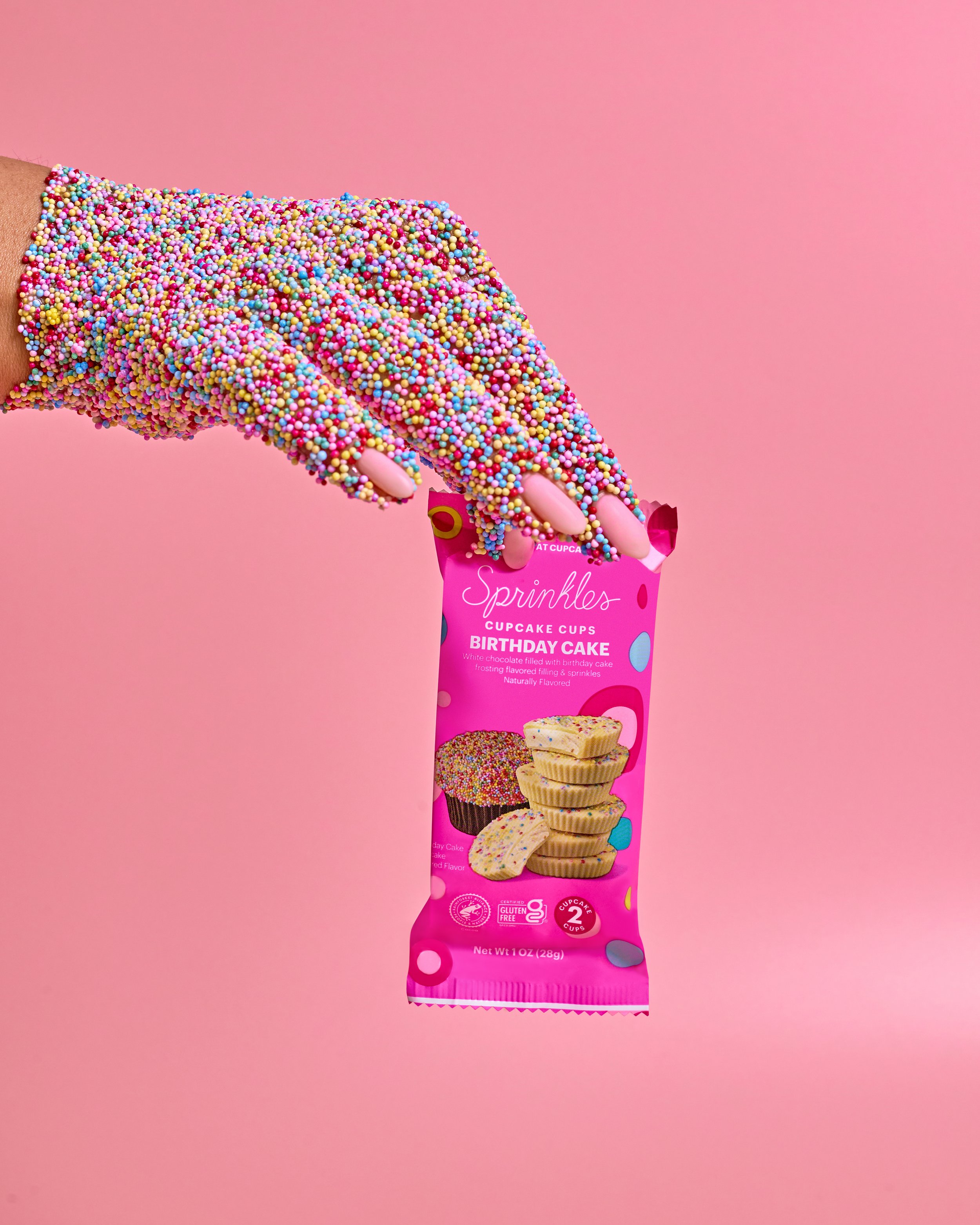
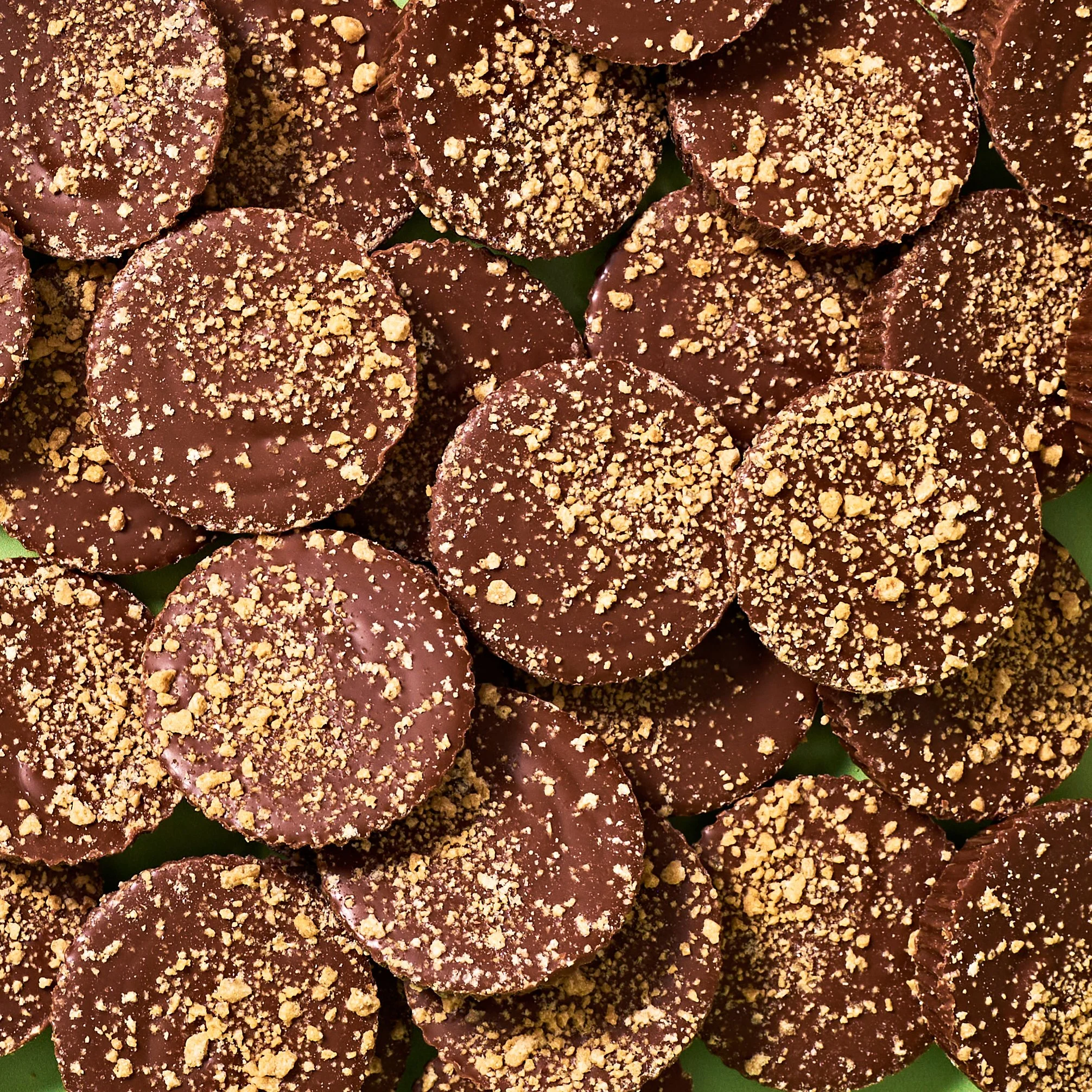
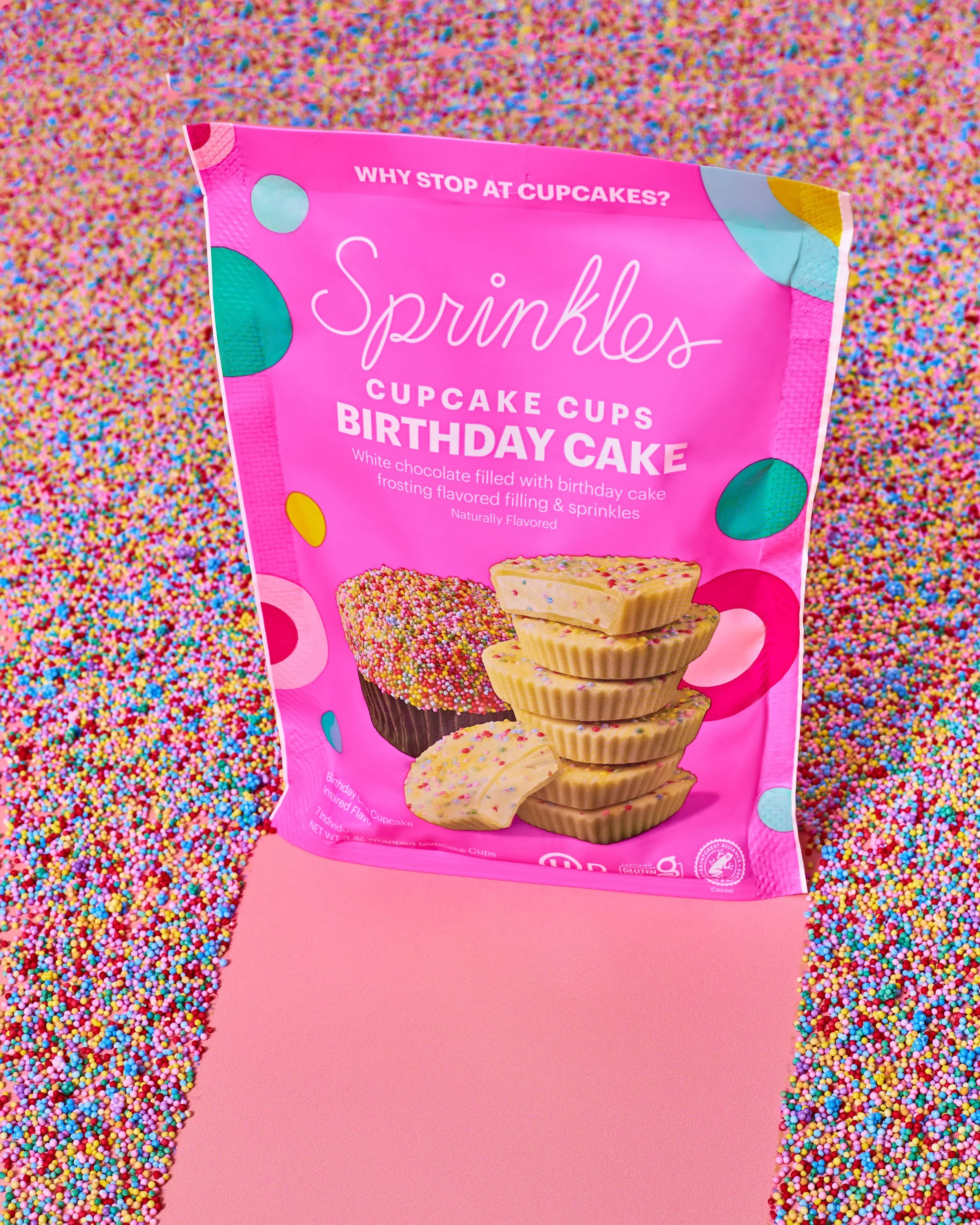
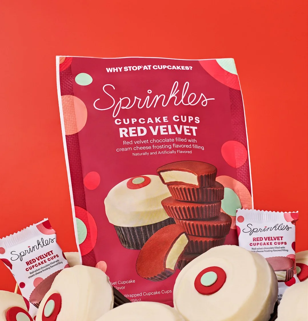
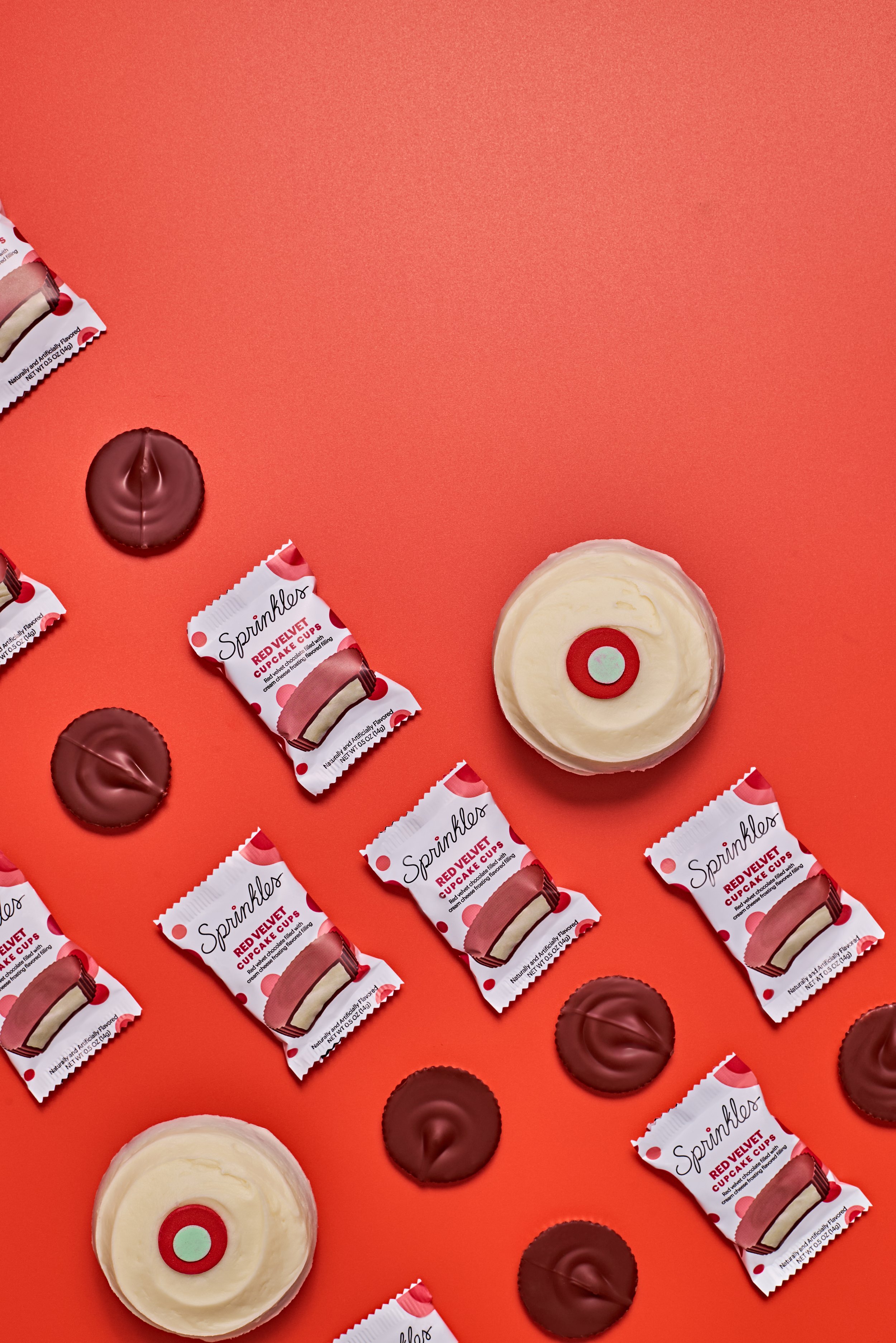
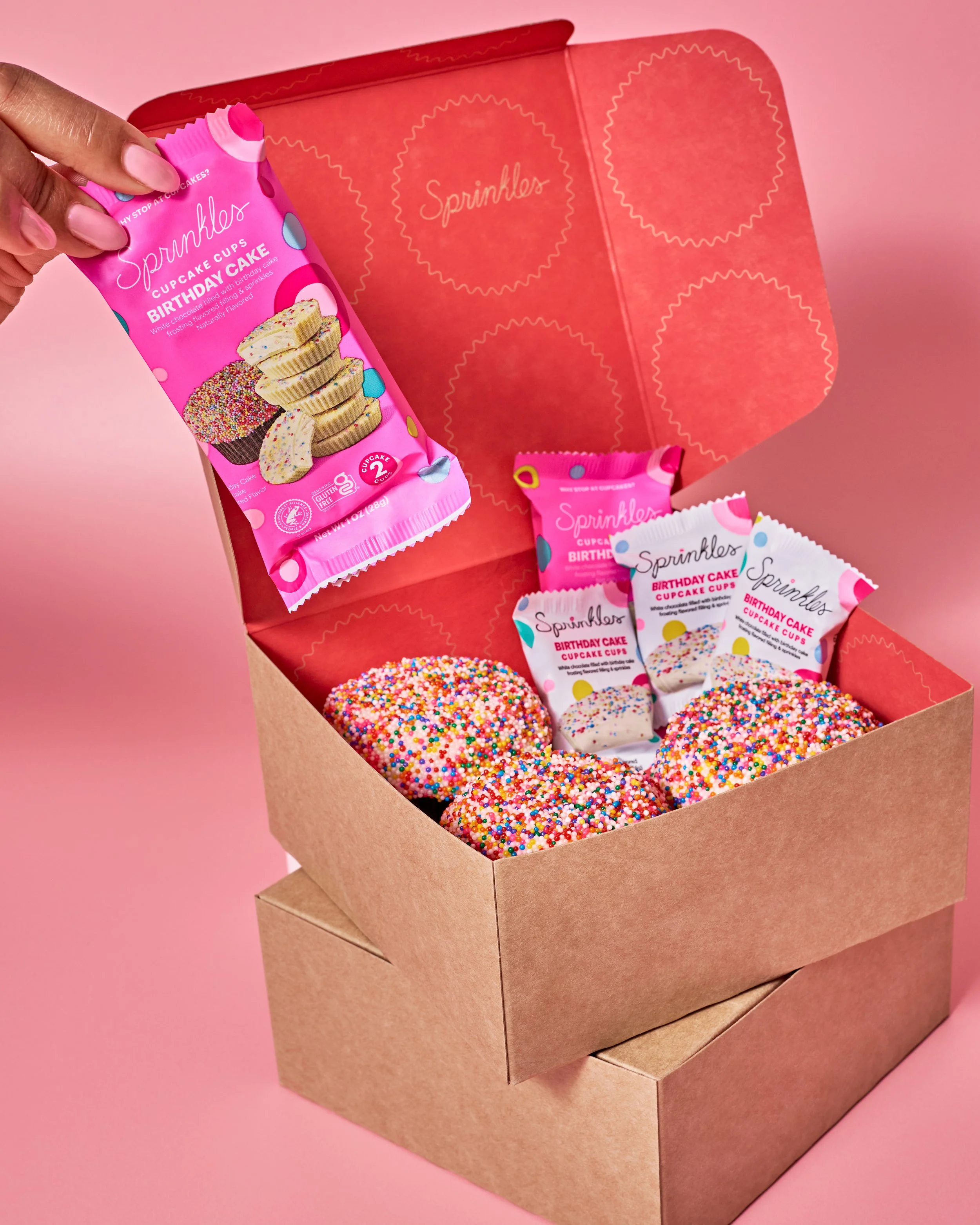
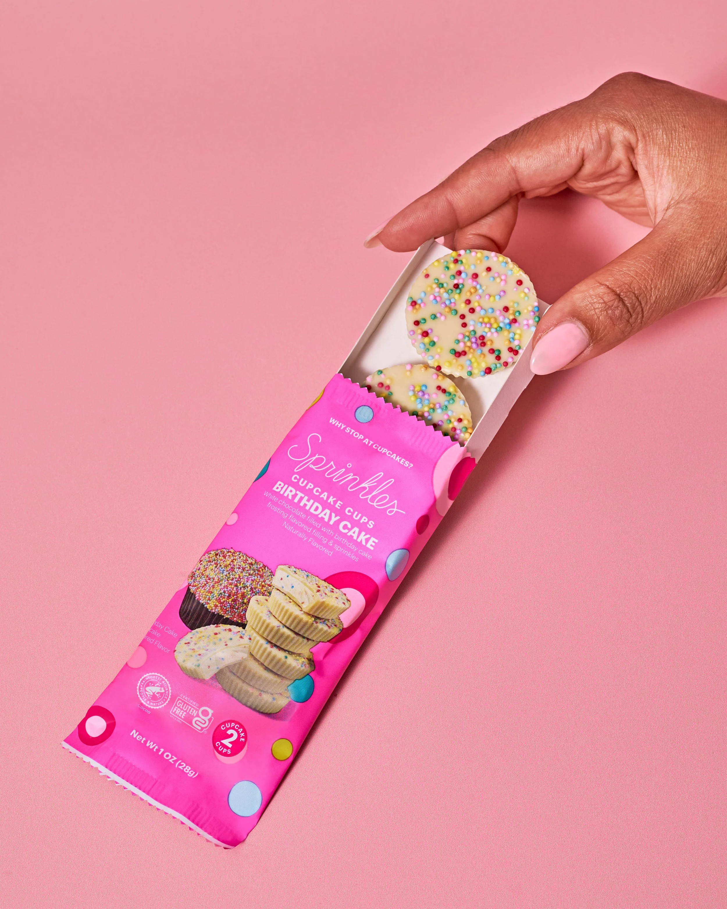
Sprinkles is one of the most recognisable bakery brands in the US — the company widely credited with launching the modern cupcake bakery category. The project came in as a visual refresh for their chocolate line: a new suite of imagery for the chocolate cupcake cups, built to communicate flavor, fun, and the playful energy the brand is known for. The brief was to replace existing imagery — previously built largely through designer overlays — with photography that actually showed what Sprinkles stood for.
The brief
The Sprinkles creative director on the client side was clear about two things: the existing imagery didn't fully capture the brand's personality, and the new work couldn't be so different that it felt jarring alongside it. The ask was a deliberate step up — more vibrant, more food-forward, more fun — but cohesive enough to sit under the same visual umbrella as what was already live. The images needed to communicate flavor cues for the chocolate line and live primarily on the website. From first phone call to final deliverables: two and a half weeks.
The challenge
The timeline was the defining constraint on this project. Two and a half weeks to mood board, assemble a crew including a prop food stylist and hand model, source props, shoot, and deliver — on a brand with an established visual identity and a client who was remote throughout. There was no room for delays anywhere in the pipeline, which made the food styling issues that emerged on shoot day the most pressured moment of the production.
The creative constraint was real too. Working within Sprinkles' brand book — their color palette, their packaging, their existing visual register — meant the brief had a ceiling on it. Every decision about backdrops, complementary colors, and prop choices had to stay close enough to the existing brand world to maintain cohesion, which left limited room to push the work further than it needed to go.
The process
The mood board was developed from Pinterest combined with a clear picture of what the client didn't want — which, on a project like this, is often just as useful as knowing what they do. The starting point for me was thinking about kids interacting with color and kind of building from there, which is all about sticking to all the pastel colors and how would a child's outlook be? The brand book provided the color framework: packaging colors drove backdrop selection, and every other decision built outward from there to ensure the product always read clearly and everything surrounding it felt cohesive.
The shoot was food-heavy rather than prop-heavy — flavor cues and the cupcake cups themselves were the primary visual language, with complementary colors and surfaces doing the work of creating energy and context. A prop food stylist handled the food preparation and presentation. A hand model was brought in for the lifestyle shots.
On the day, food styling complications caused delays to the schedule. The team worked through them and the shoot completed, but it compressed the production window in a way that required real-time problem-solving to keep things on track.
The outcome
The client was happy with the results. The images were delivered within the agreed timeline. Shortly after the shoot, Sprinkles LLC shut down — and the work was never published. It remains in the portfolio as a record of the process and the production rather than a live campaign.
Creative POV
Sprinkles is the most constrained brief in this portfolio, and that's worth being honest about. Working within a brand identity that limited how far the imagery could move meant the final work didn't go as far as it could have under different conditions. The client got what they needed and were happy with it — and delivering that within a two-and-a-half-week window on a recognizable national brand, with a remote client and a full crew, is its own kind of proof. But the creative ceiling was real, and this project is a clear example of the difference between executing within a brand and being given the space to build one.