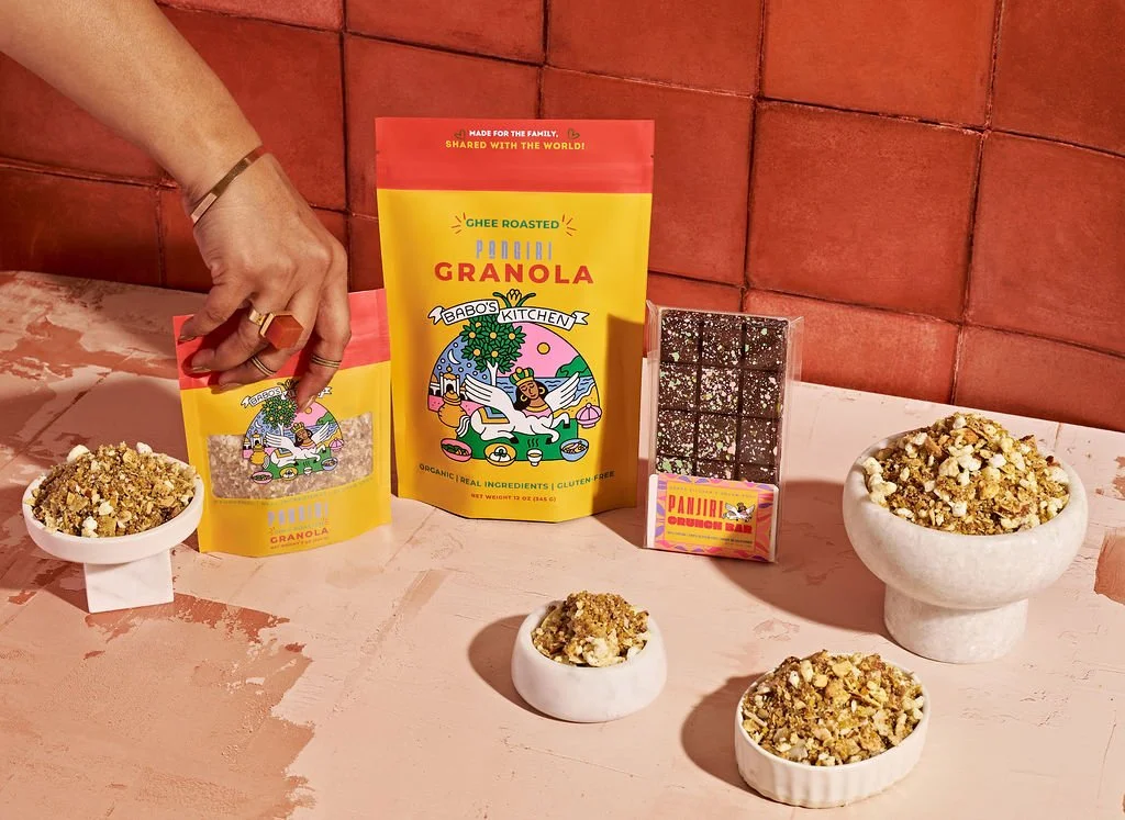
BABO’S PANJIRI
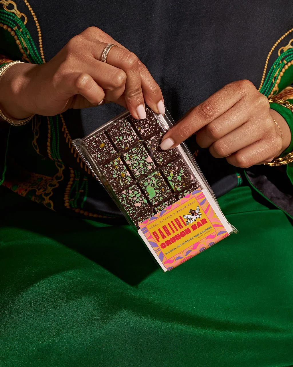
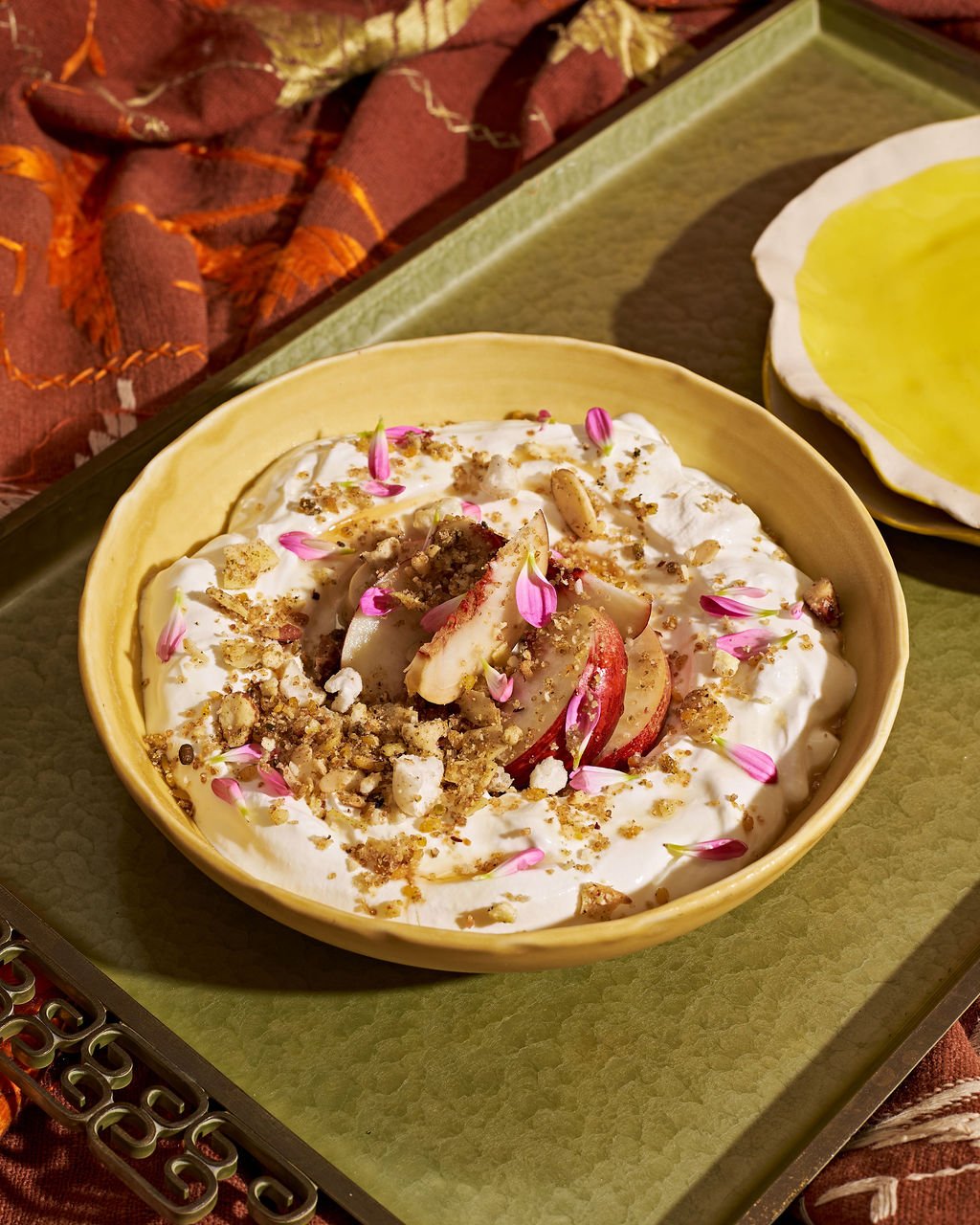
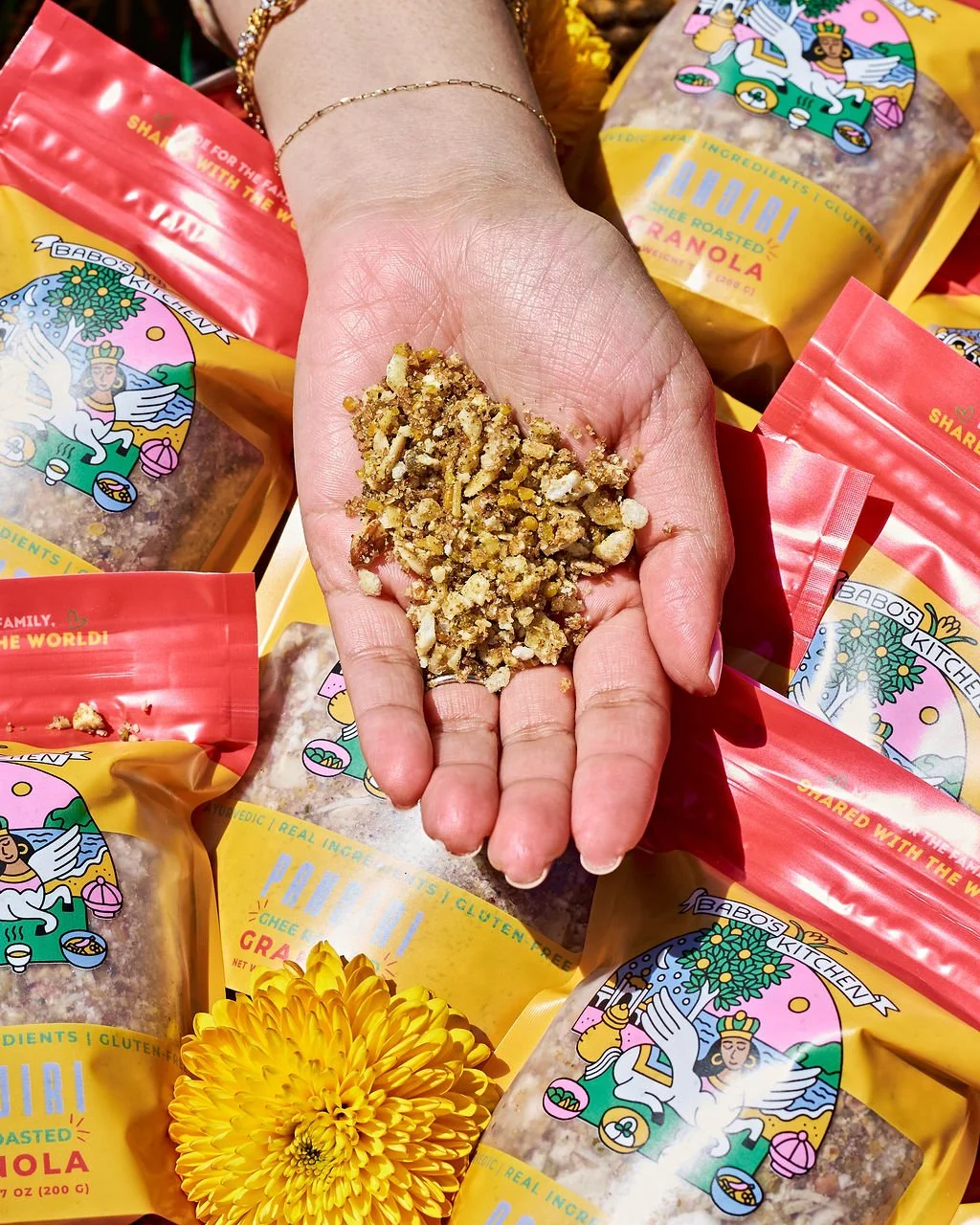
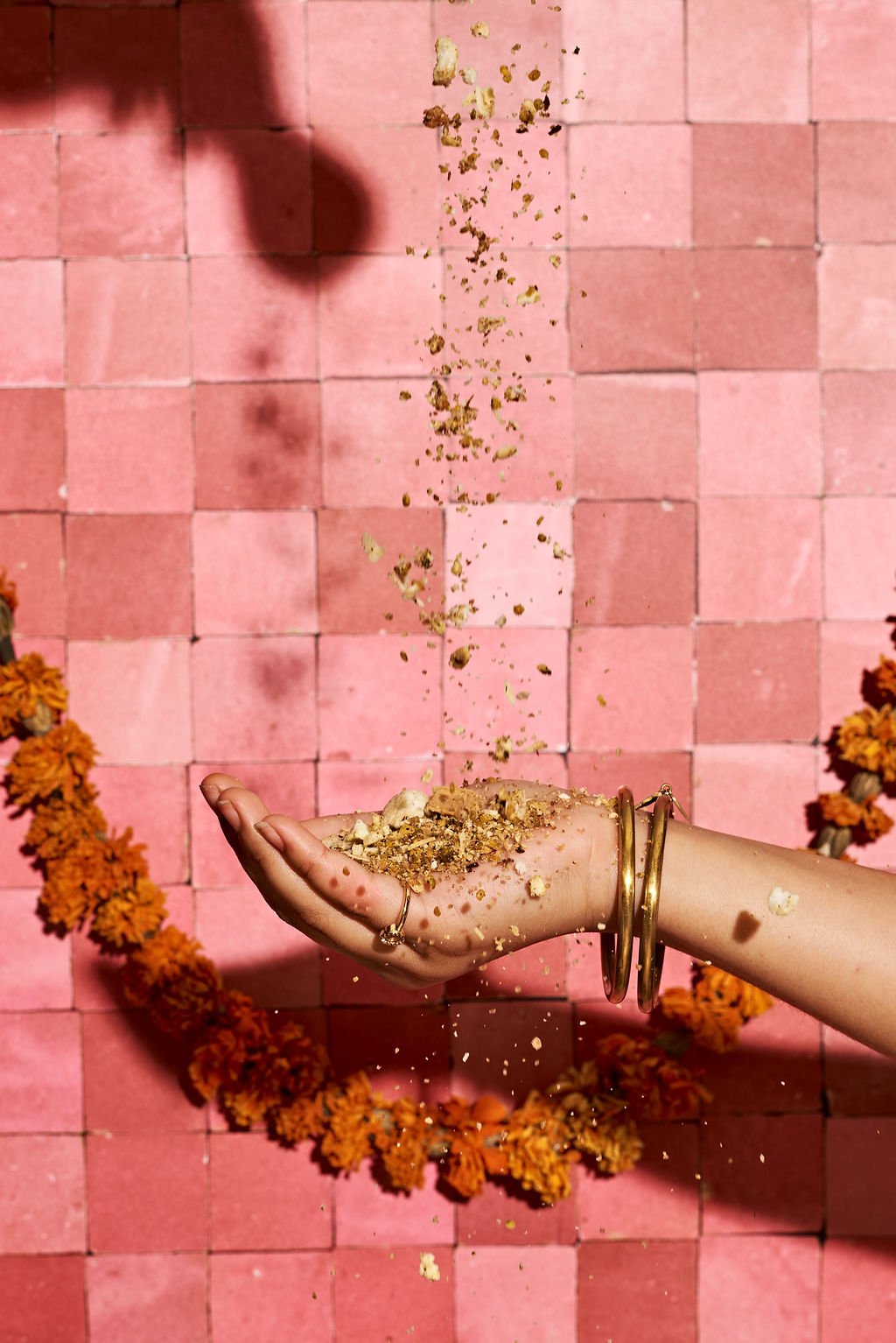
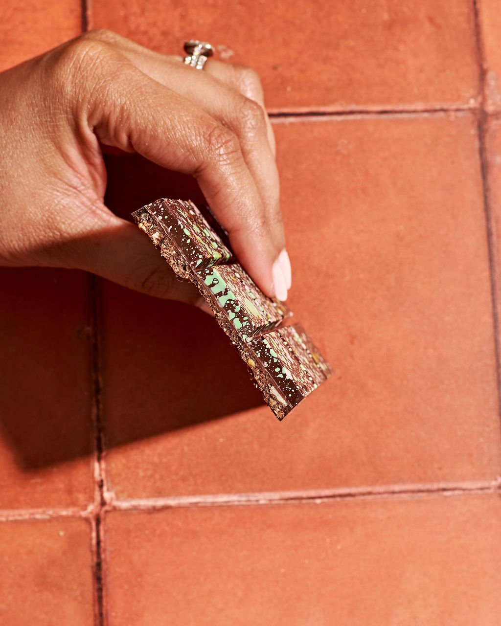
Babo’s Panjiri came to me at a pivotal moment: a desire to evolve the brand’s visual identity while staying rooted in tradition. The goal was to create imagery that felt authentic, warm, and real—positioning panjiri as a nourishing, everyday ritual and a modern alternative to granola, without losing its cultural depth.
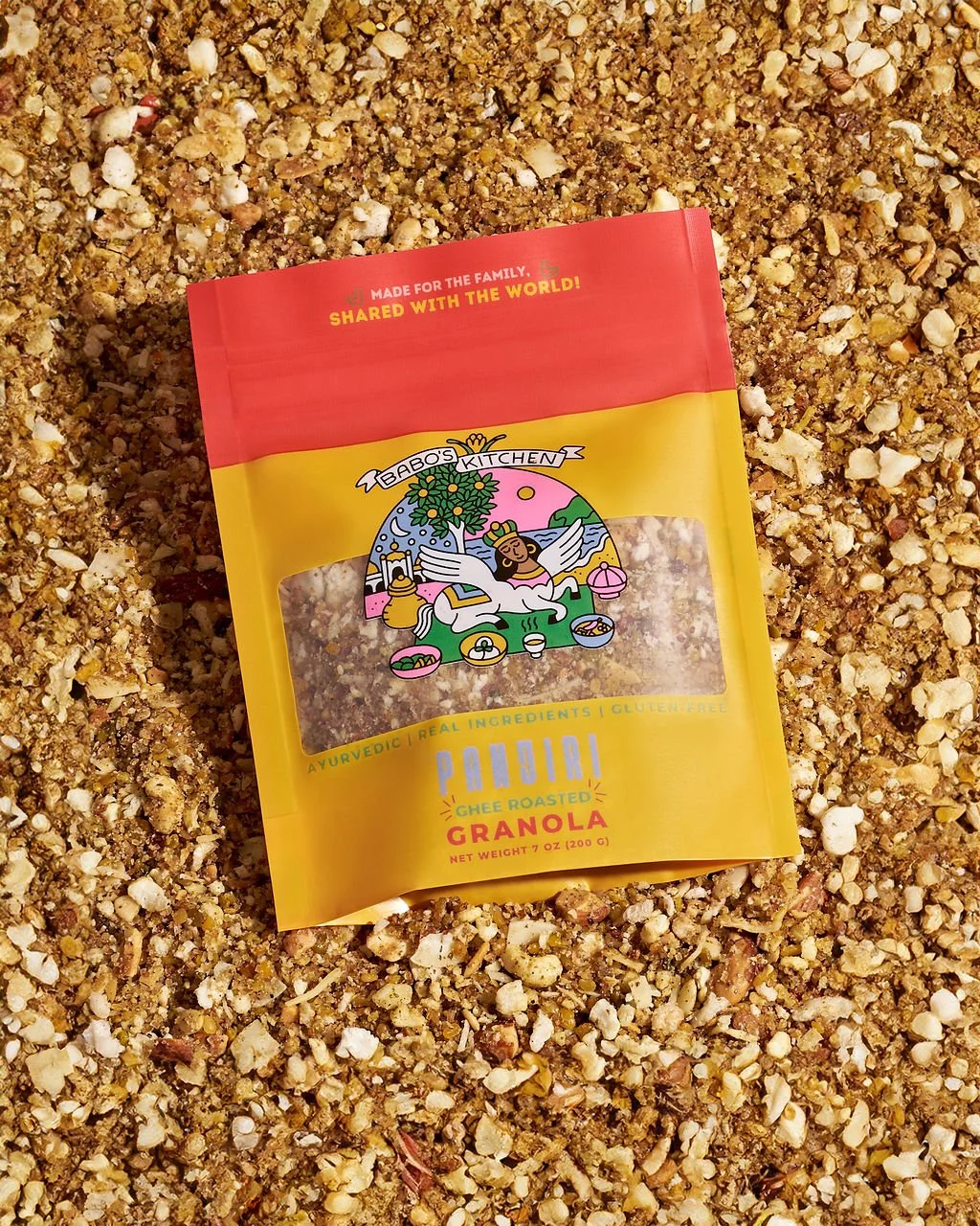
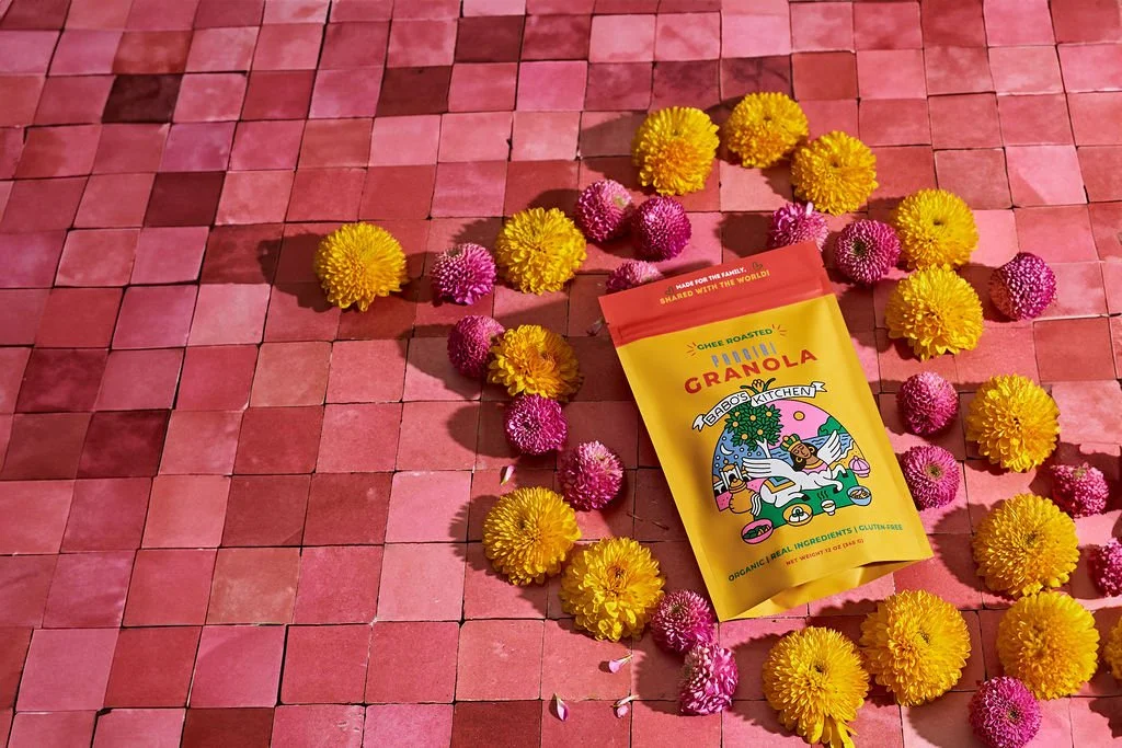
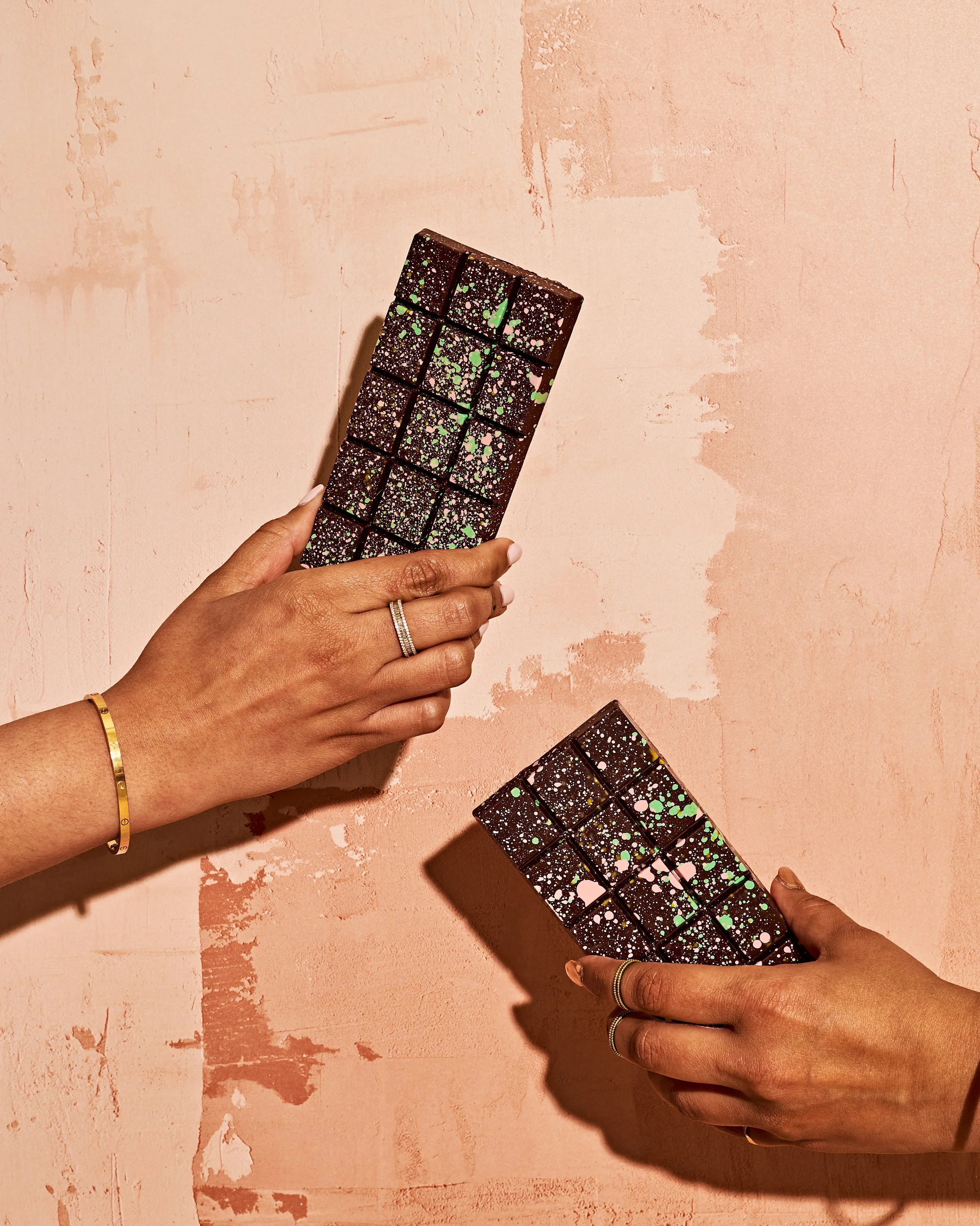
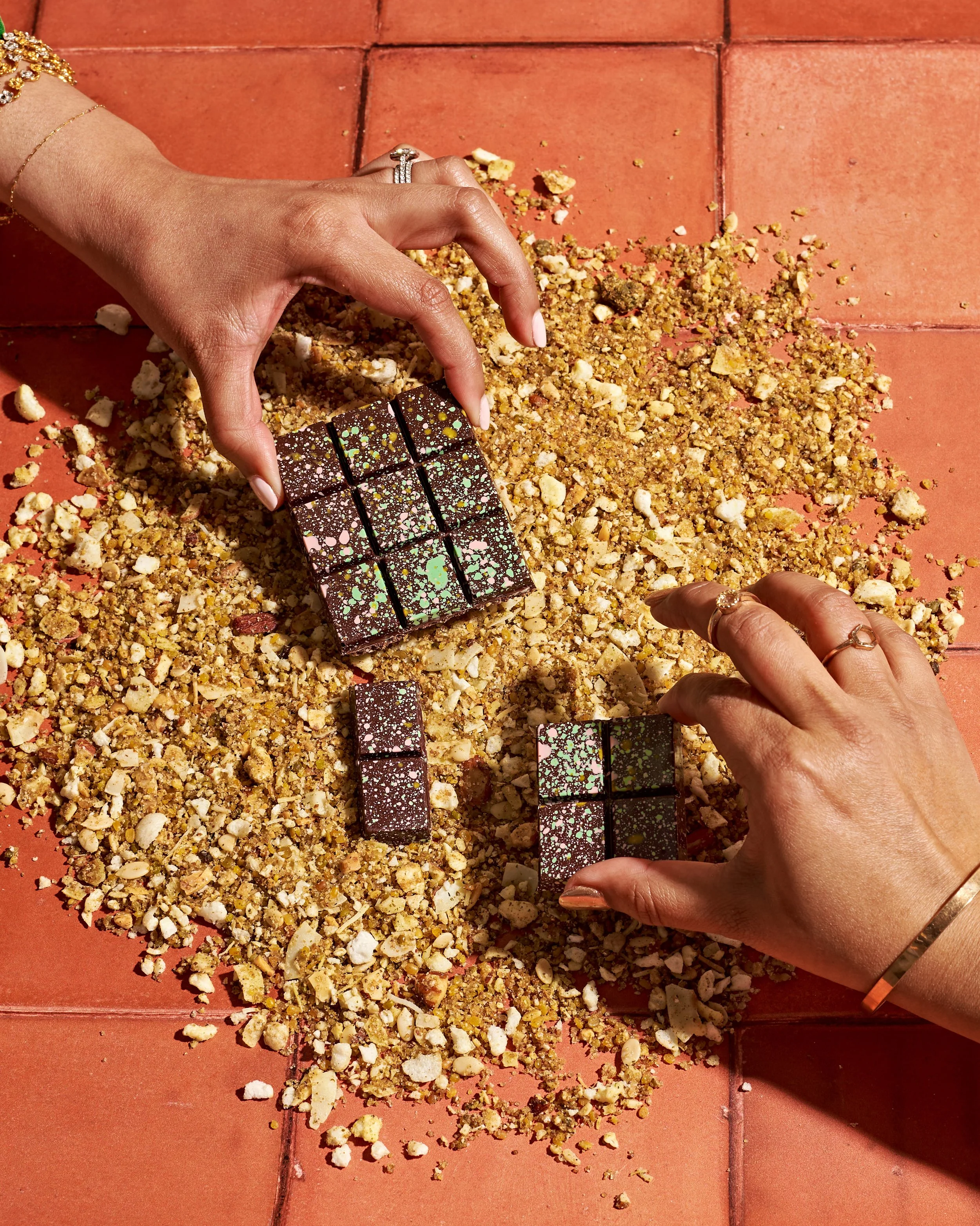
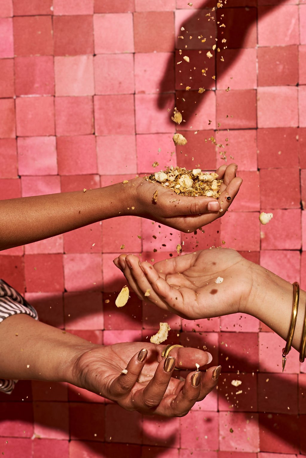
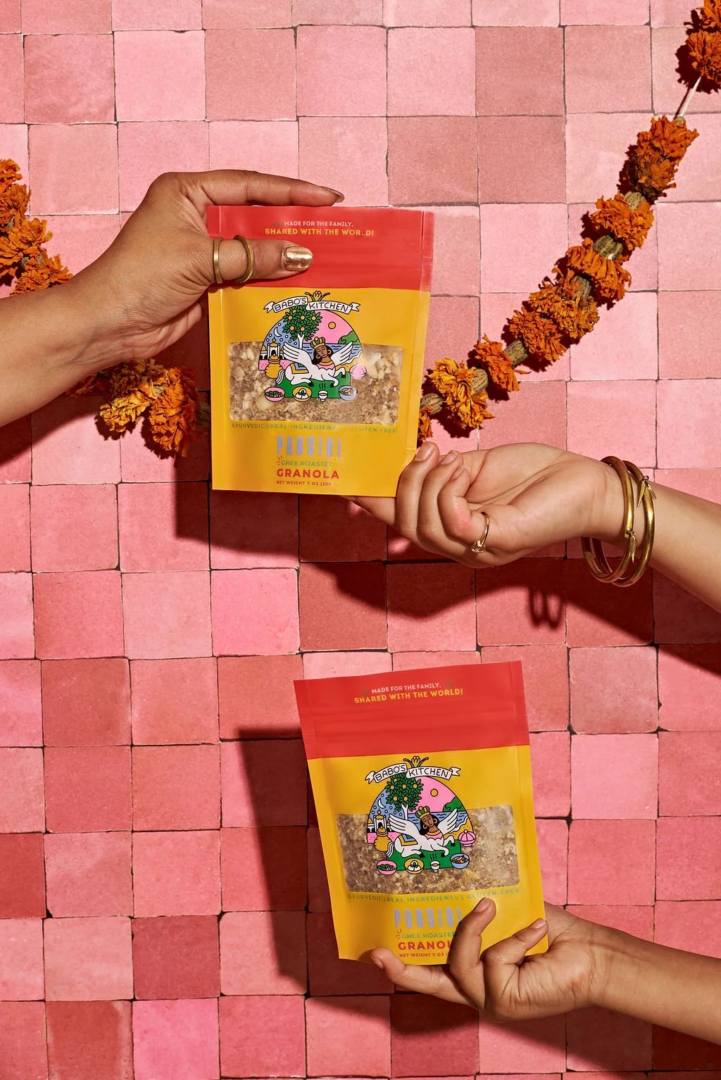
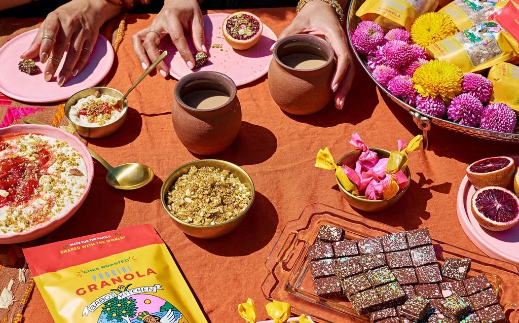
I partnered with the client to clarify the brand story, audience, and emotional direction before a camera was ever picked up. Together, we built a shot list and visual framework rooted in storytelling—deciding what moments to show, what textures to highlight, and what the imagery needed to communicate at first glance.
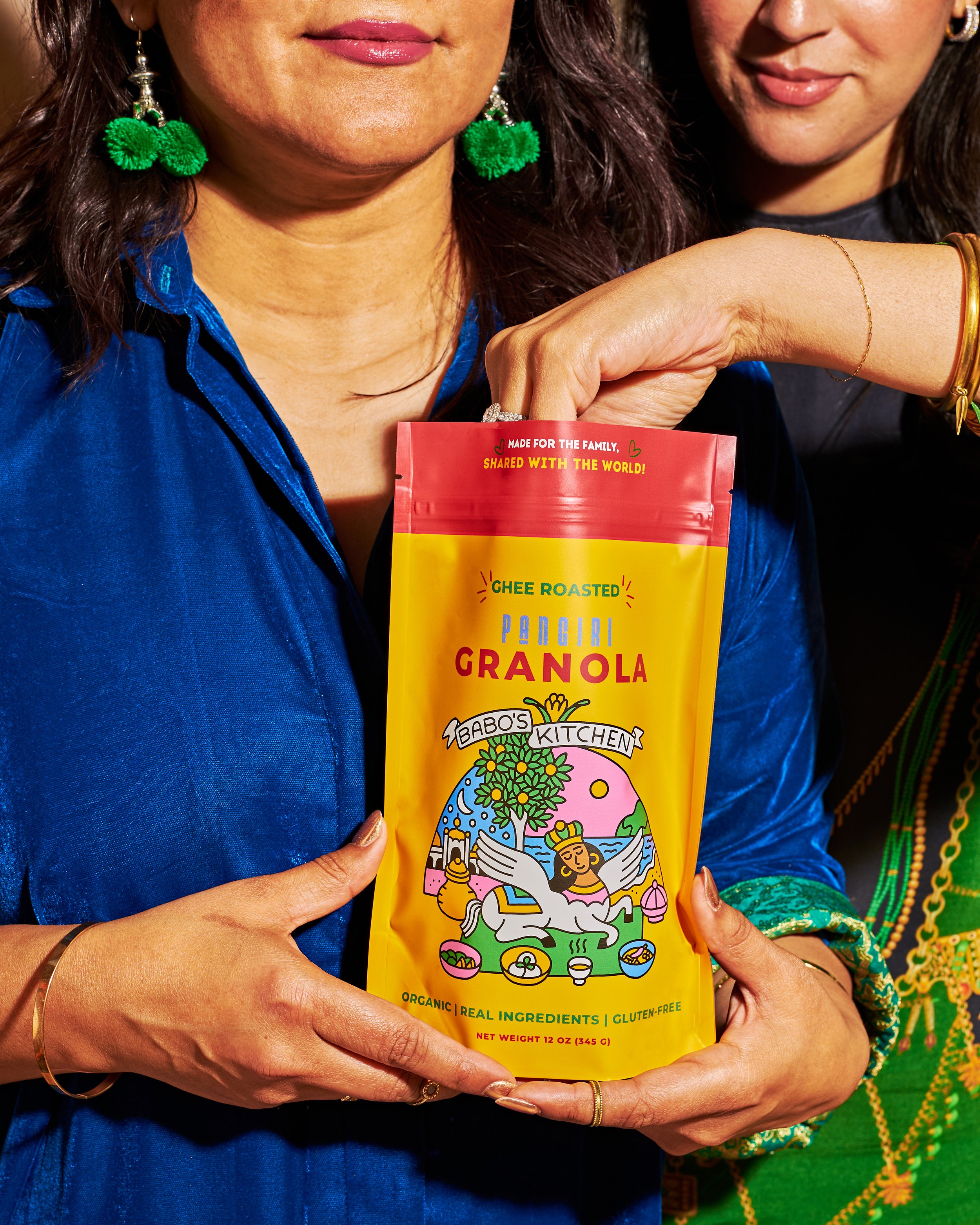
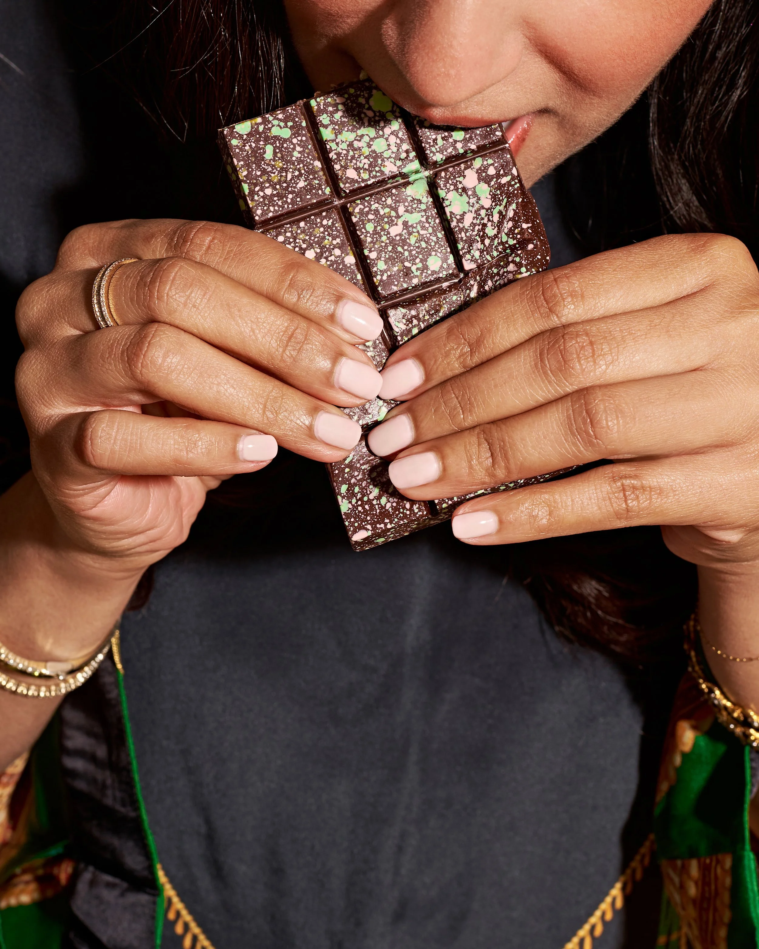
I led the creative direction for the project, developing the color palette, prop styling, and overall visual language to align with the brand’s refreshed identity. The imagery was intentionally styled to feel real, warm, and human—inviting the viewer into the experience rather than presenting a polished, distant product.
By combining strategic creative direction with photography and hands-on styling, this project resulted in imagery that supports Babo’s evolving brand—grounded in culture, elevated for modern consumers, and built to connect.